Menus · Fairmont & Raffles Doha · Accor Paper amuse-bouches that make a strong impression
In 2023, Accor unveiled two new luxury hotels in partnership with Katara Hospitality: Fairmont Doha and Raffles Doha, located in the Katara Towers, whose ring-shaped silhouette is emblematic of the Lusail cityscape.
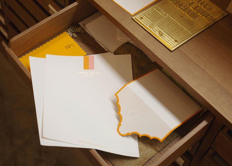
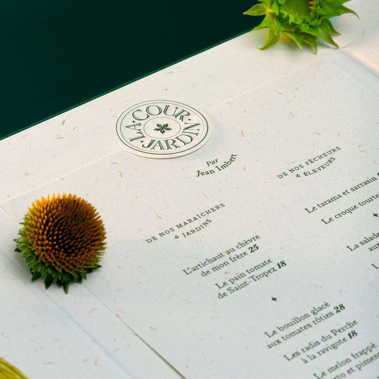
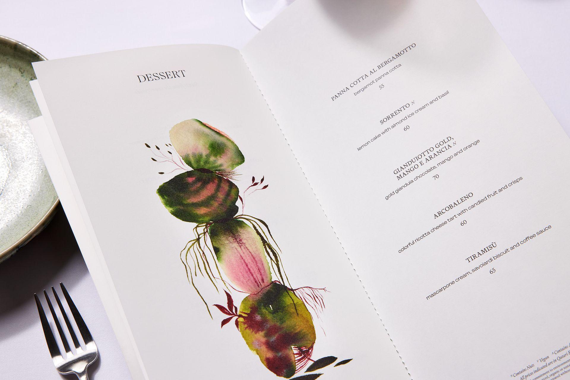
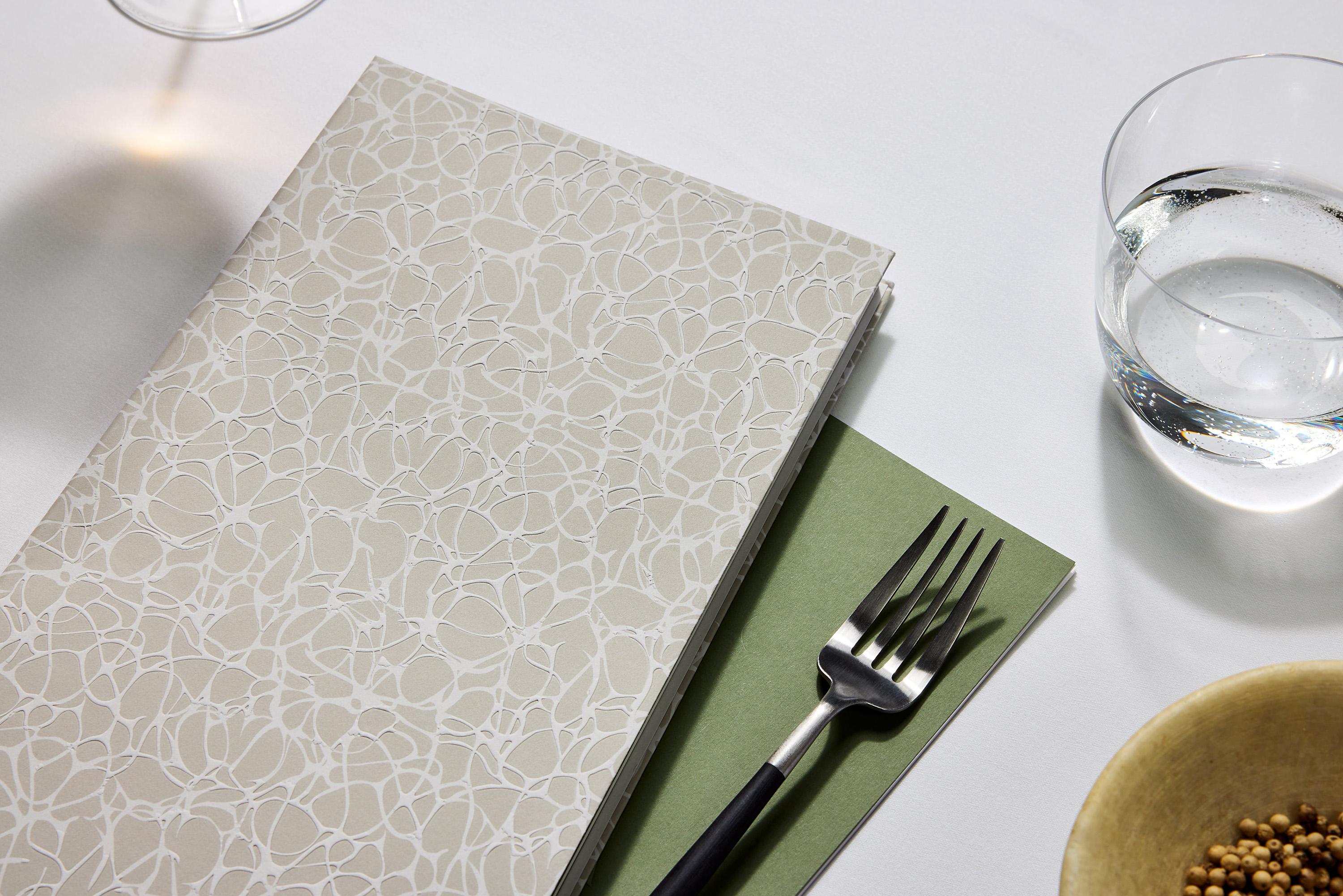
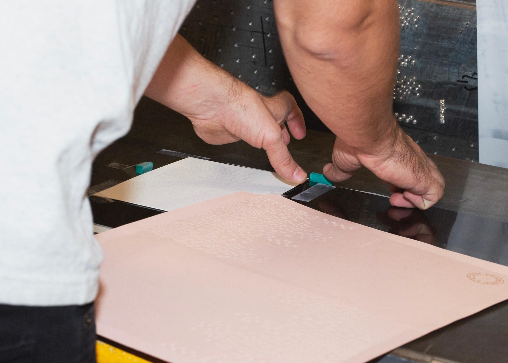
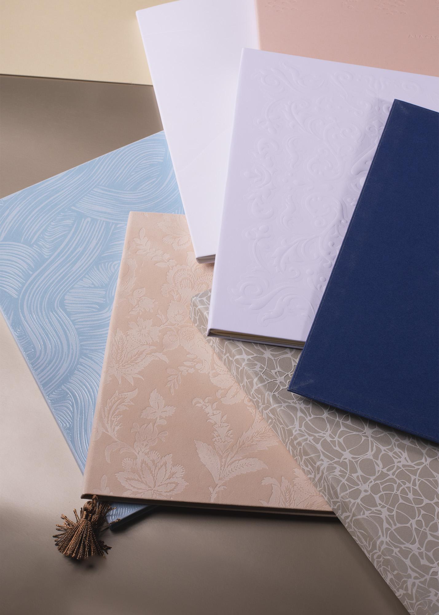
This major launch is accompanied by the opening of more than ten restaurants for which BOND has designed twenty-one menus and cards with aesthetics as varied as the influences that converge in this city, which has become a high place of Middle Eastern hospitality. The result is an eclectic collection that sounds like an ode to flavours from around the globe. To powerfully embody this diversity, we explored a wide range of printing solutions, some of whose secrets we reveal here, though by no means exhaustively.
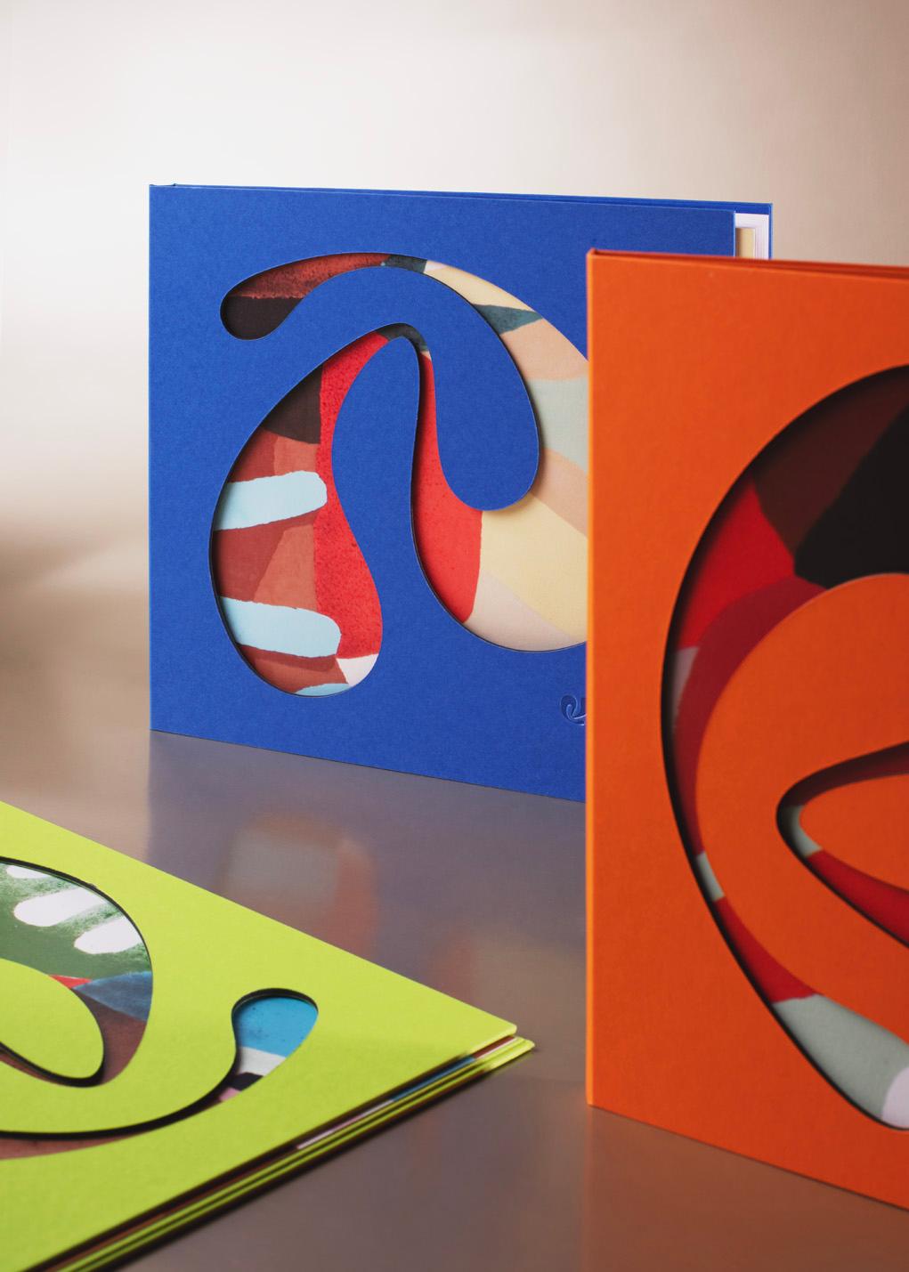
Thus, the colourful cardboard covers of the menus at the Vaya restaurant (Fairmont) feature a cheerful die-cut shape that echoes the restaurant's architectural design, inspired by the works of Pedro Rogerio and the unique energy of Latin America.
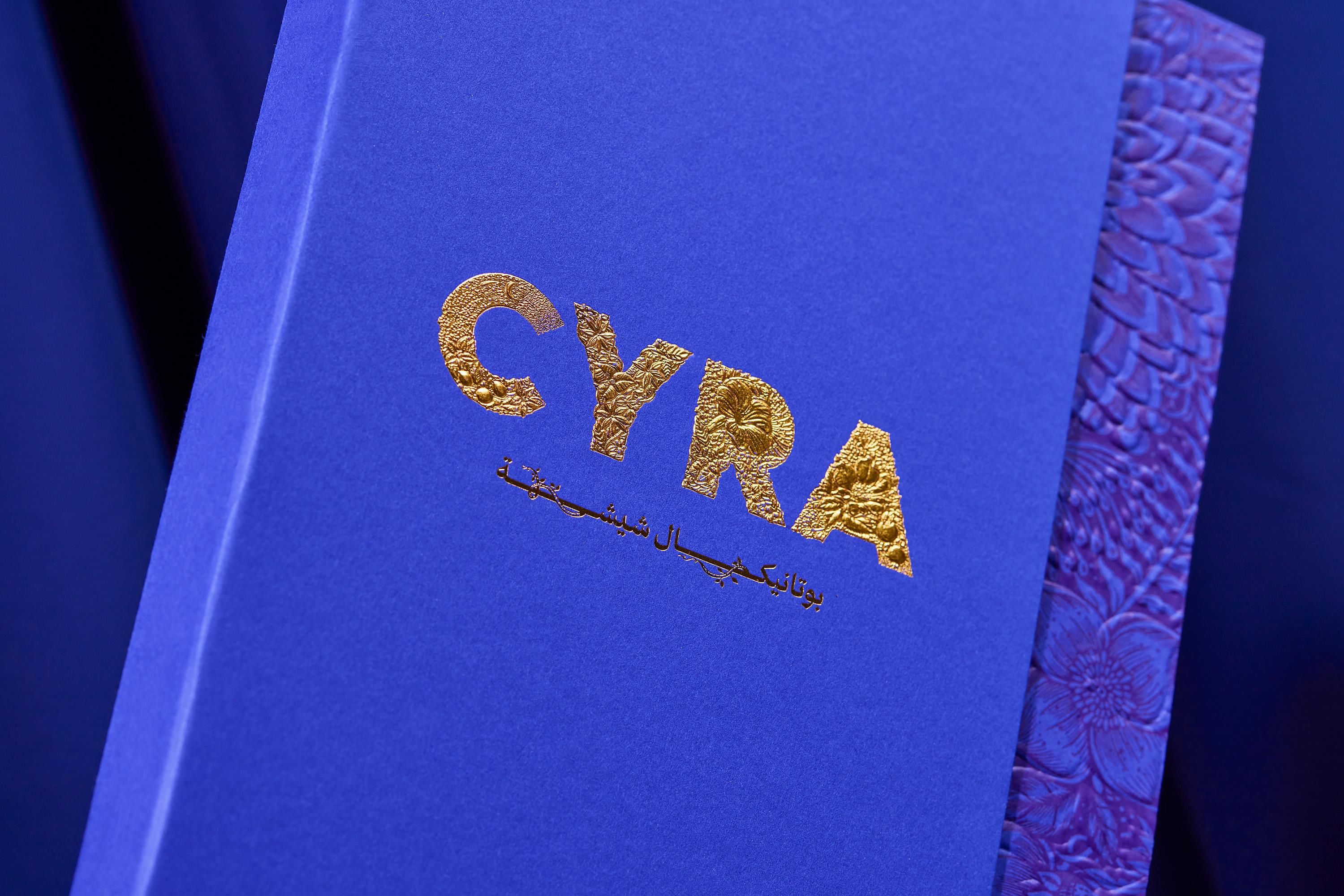
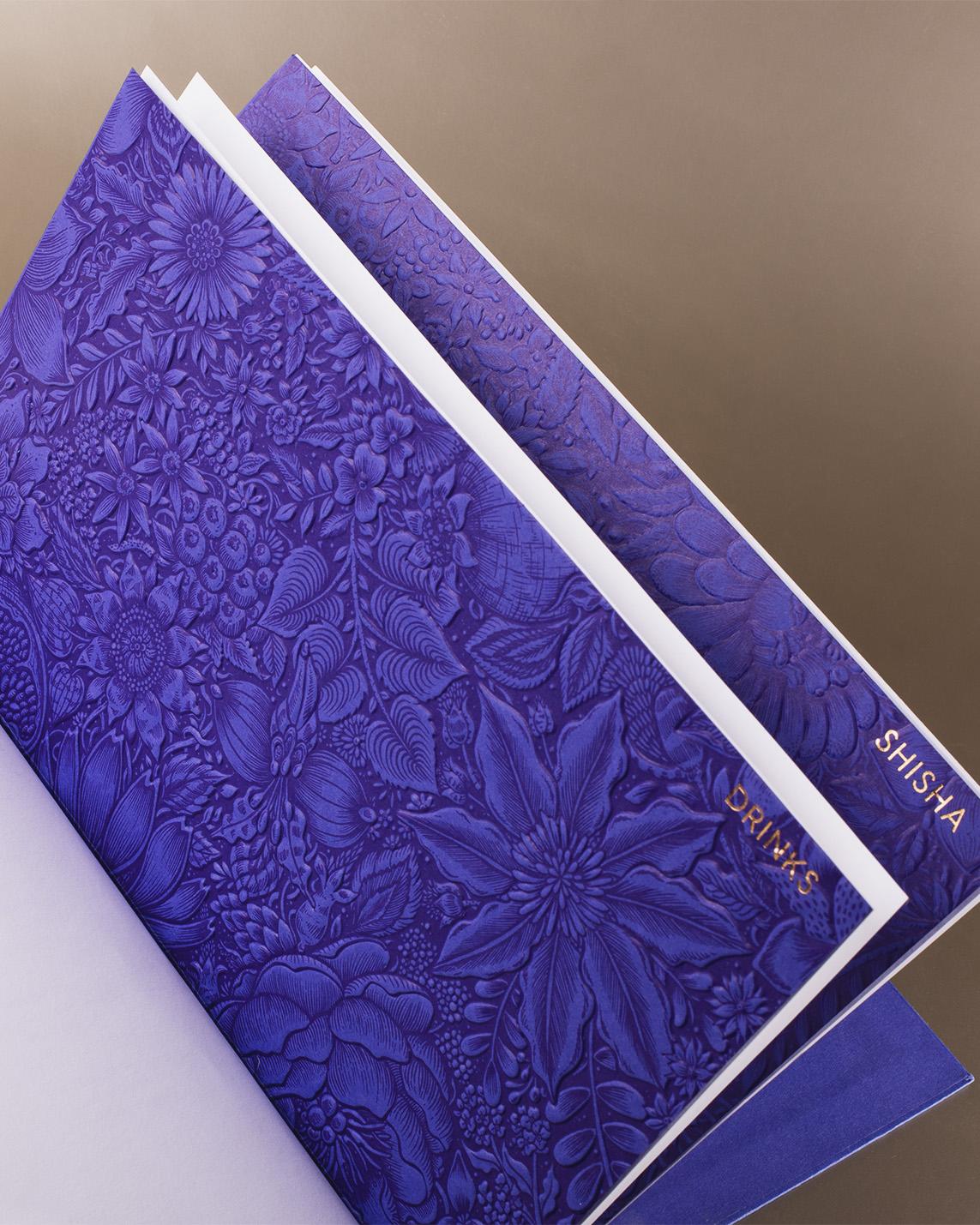
At Cyra (Fairmont), the menus are adorned with the restaurant's logo, nestled among floral motifs. The whole design is crafted with a subtle raised foil that brings out every detail of this delicate composition. The indigo inserts that punctuate the inside pages and help customers make their choices are also adorned with a floral motif. Revealed by a combination of multi-level embossing and spot colour litho printing, it reflects the restaurant's botanical spirit.
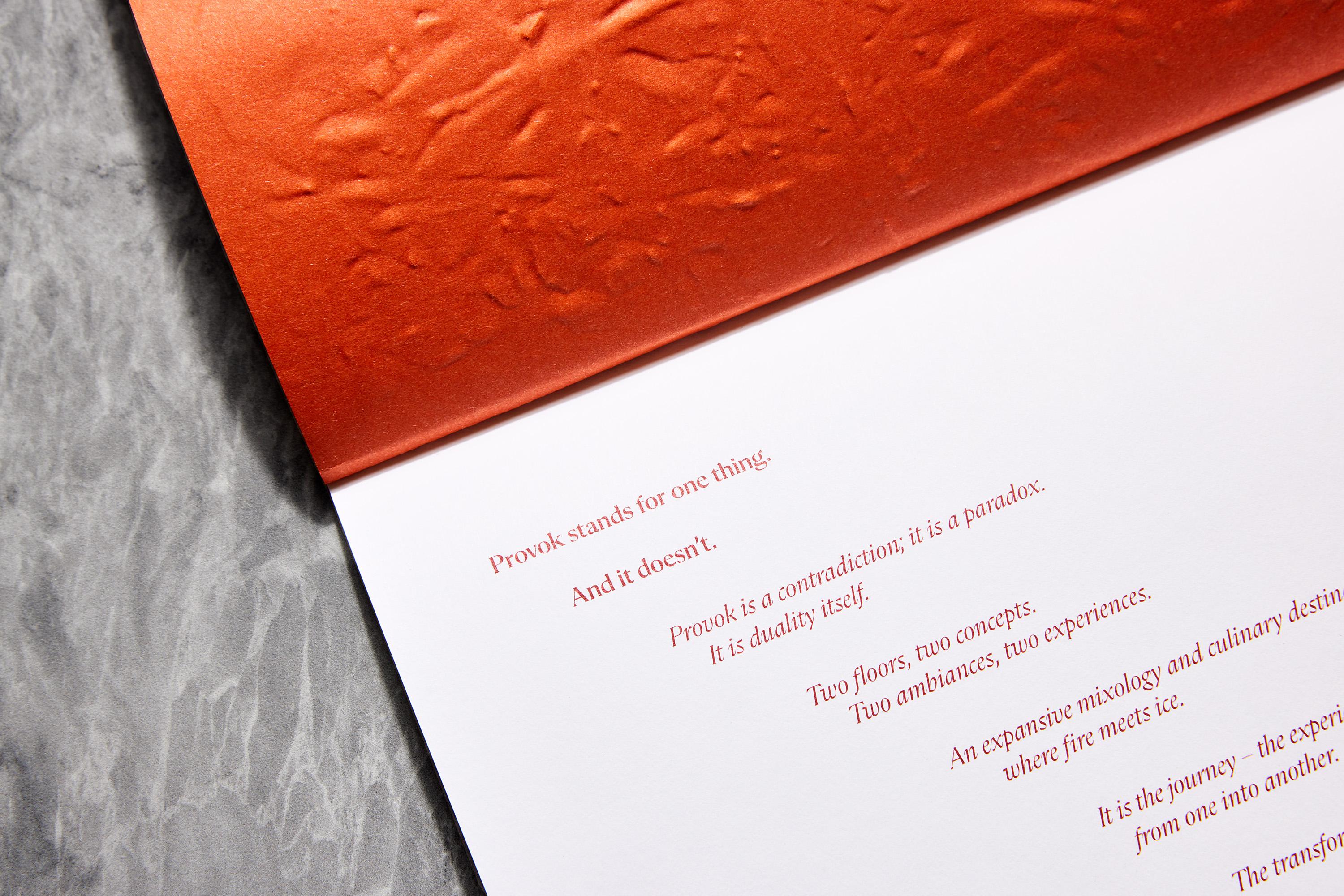
The menus at Provok restaurant (Fairmont) combine fire, lava and ice in a series of elegant and explosive covers. Raised foil on Japanese paper brings them to life in a combination of textures and precision that can be appreciated right down to their Japanese-style binding. They thus become symbols of the restaurant's paradoxical atmosphere: balanced and fiery.
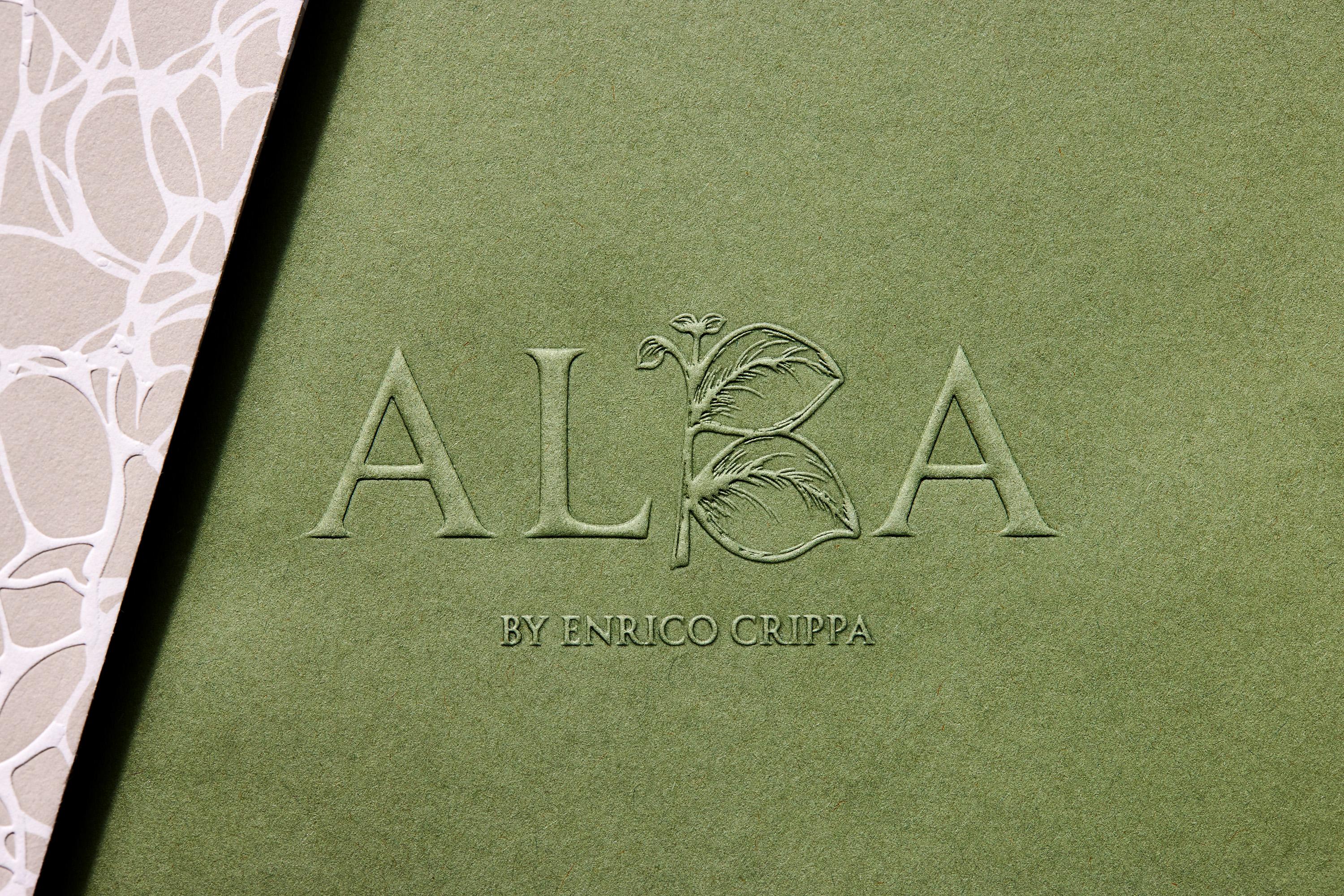
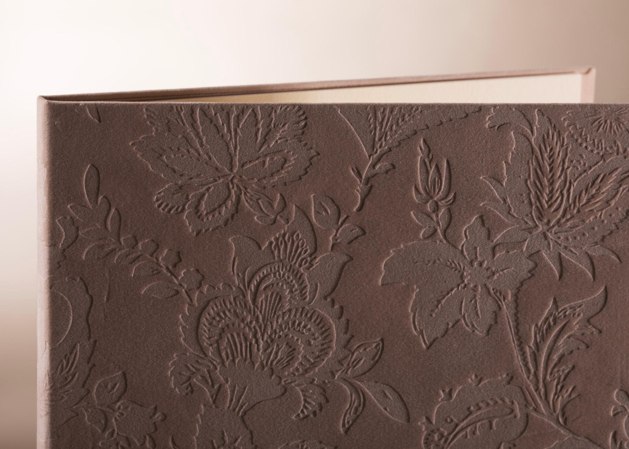
Finally, two distinct creations were developed for the L'Artisan and Alba restaurants (Raffles). Wrapped in velvet, the covers of L'Artisan's menus are hot-stamped to reveal sublime floral patterns carved into the material. Playing with the variations in texture and colour induced by the heat, our artisans have succeeded in achieving a matte finish similar to that of woven silk. For Alba, white raised silk-screen printing simulates a mineral, marbled texture, echoing the sophistication of the Italian restaurant.
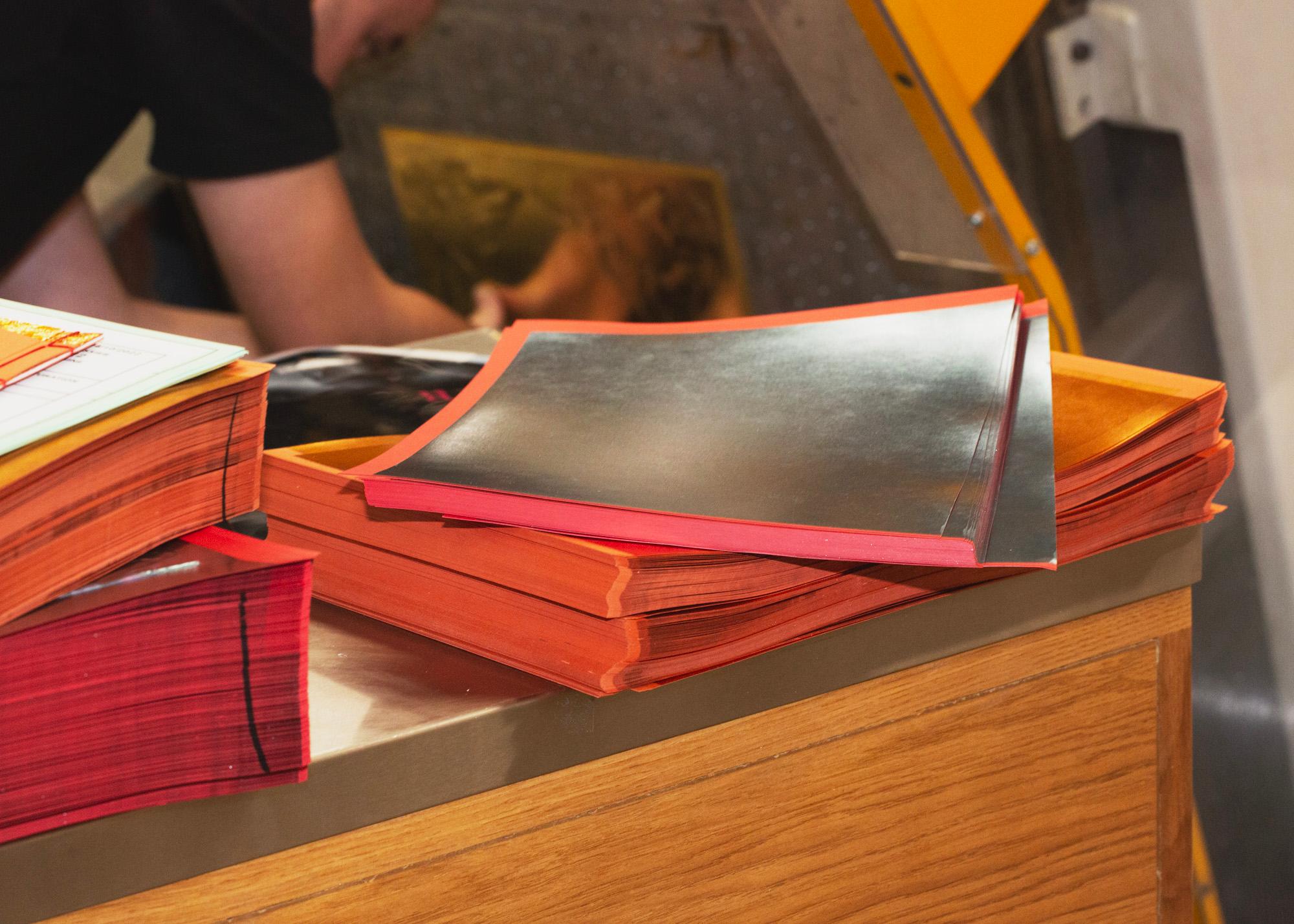
In six months, our workshops have produced more than two thousand menus with great precision, taking into account measured choices and the necessary balance between creativity and functionality. Much more than simple menus, these precious printed objects accompany the culinary experience, conveying the same sense of refinement as the restaurants they represent. The expertise of the graphic designer and printer combine here to enhance the art of hospitality, between architecture, interior design and brand collateral.
>> Contact us to work together on creating collateral that fully supports your customers' experience!
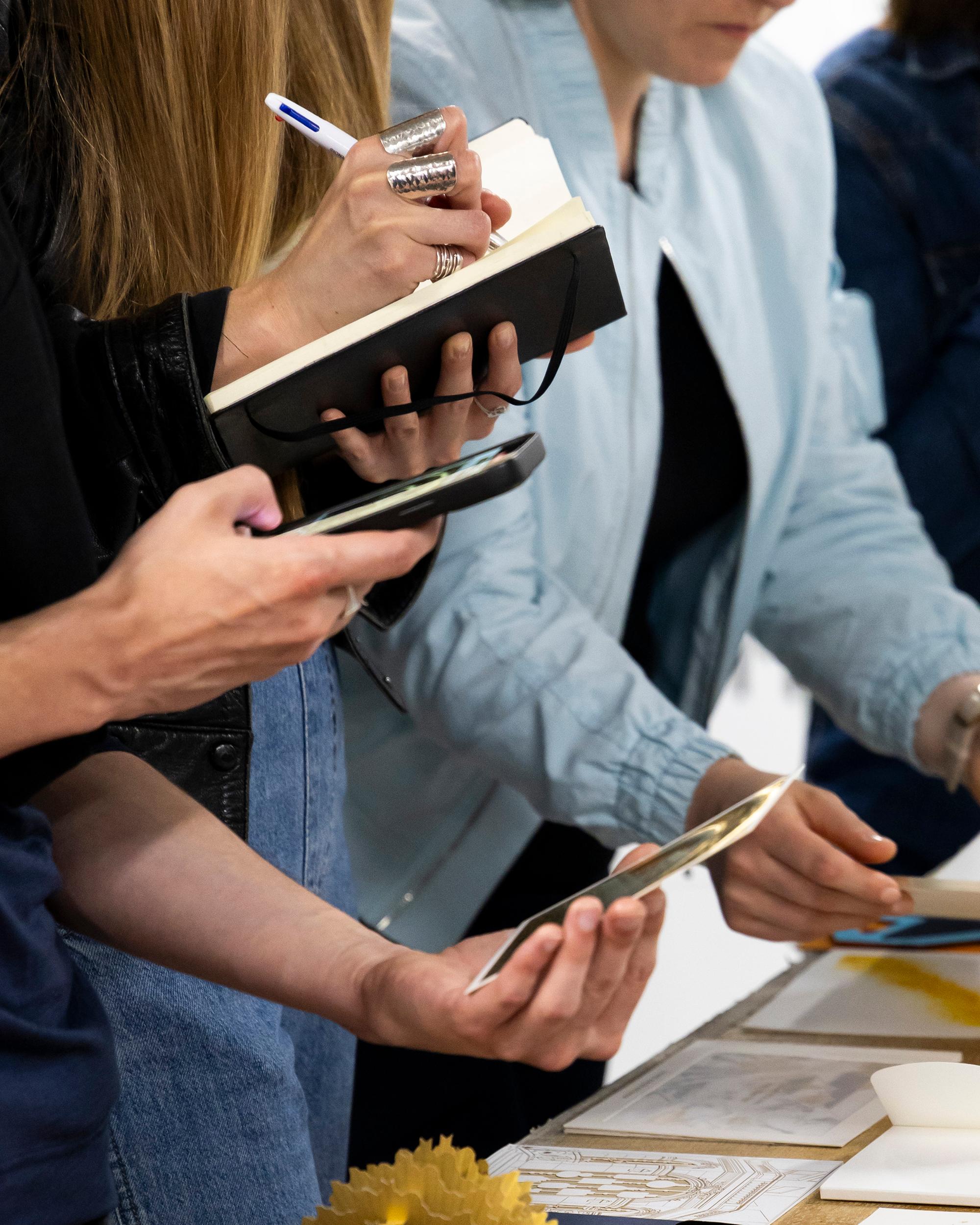
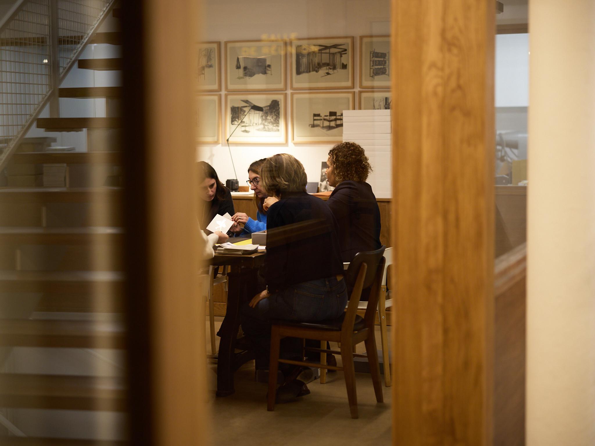
Behind the scene
The Workshops
"Much more than simple menus, these precious printed objects accompany the culinary experience, conveying the same sense of refinement as the restaurants they represent."
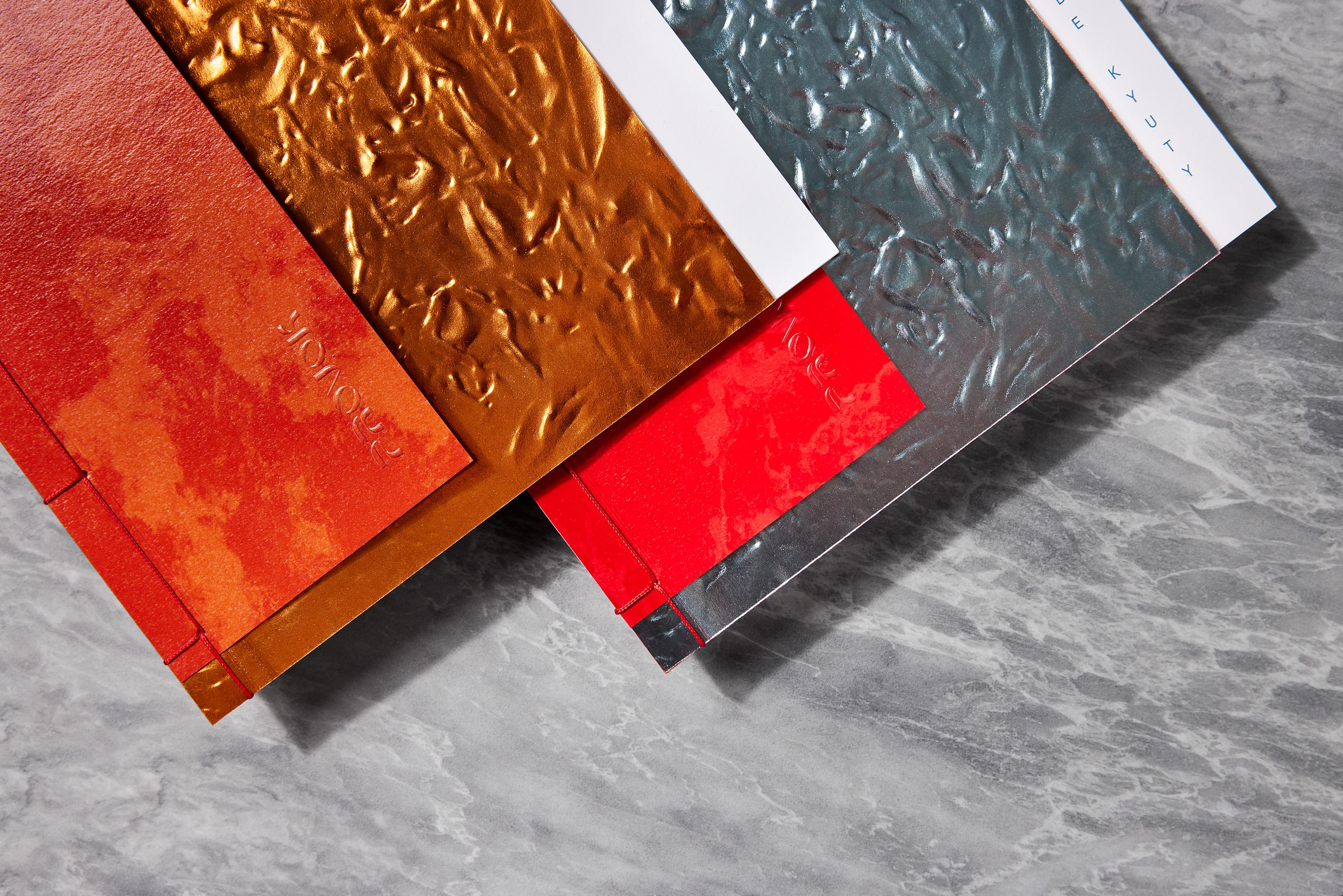
"The menus at Provok restaurant combine fire, lava and ice in a series of elegant and explosive covers. Raised foil on Japanese paper brings them to life in a combination of textures and precision that can be appreciated right down to their Japanese-style binding."
"Wrapped in velvet, the covers of L'Artisan's menus are hot-stamped to reveal sublime floral patterns carved into the material."
Give your customers’ experience a new dimension through finely crafted, bespoke print objects: contact us!