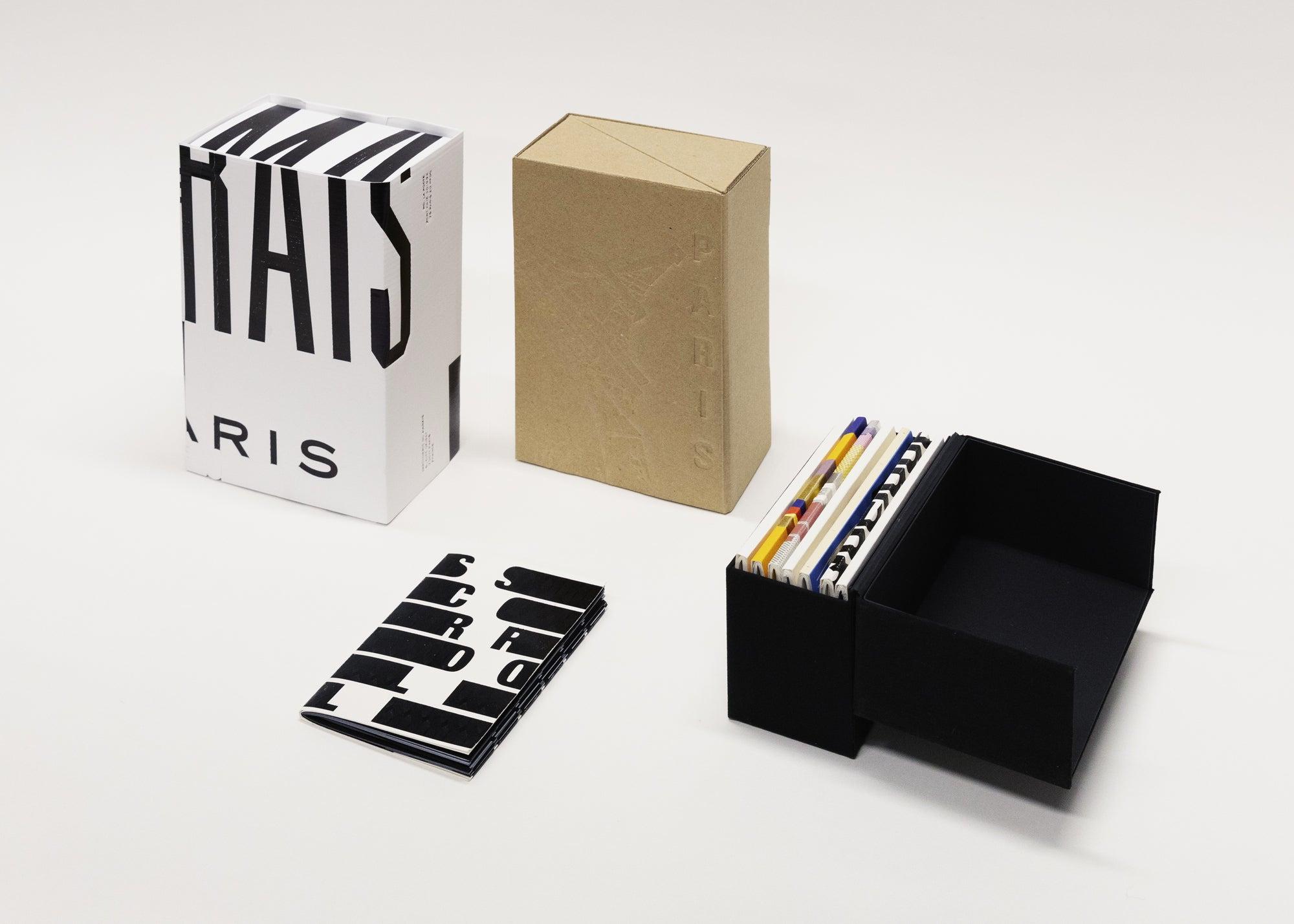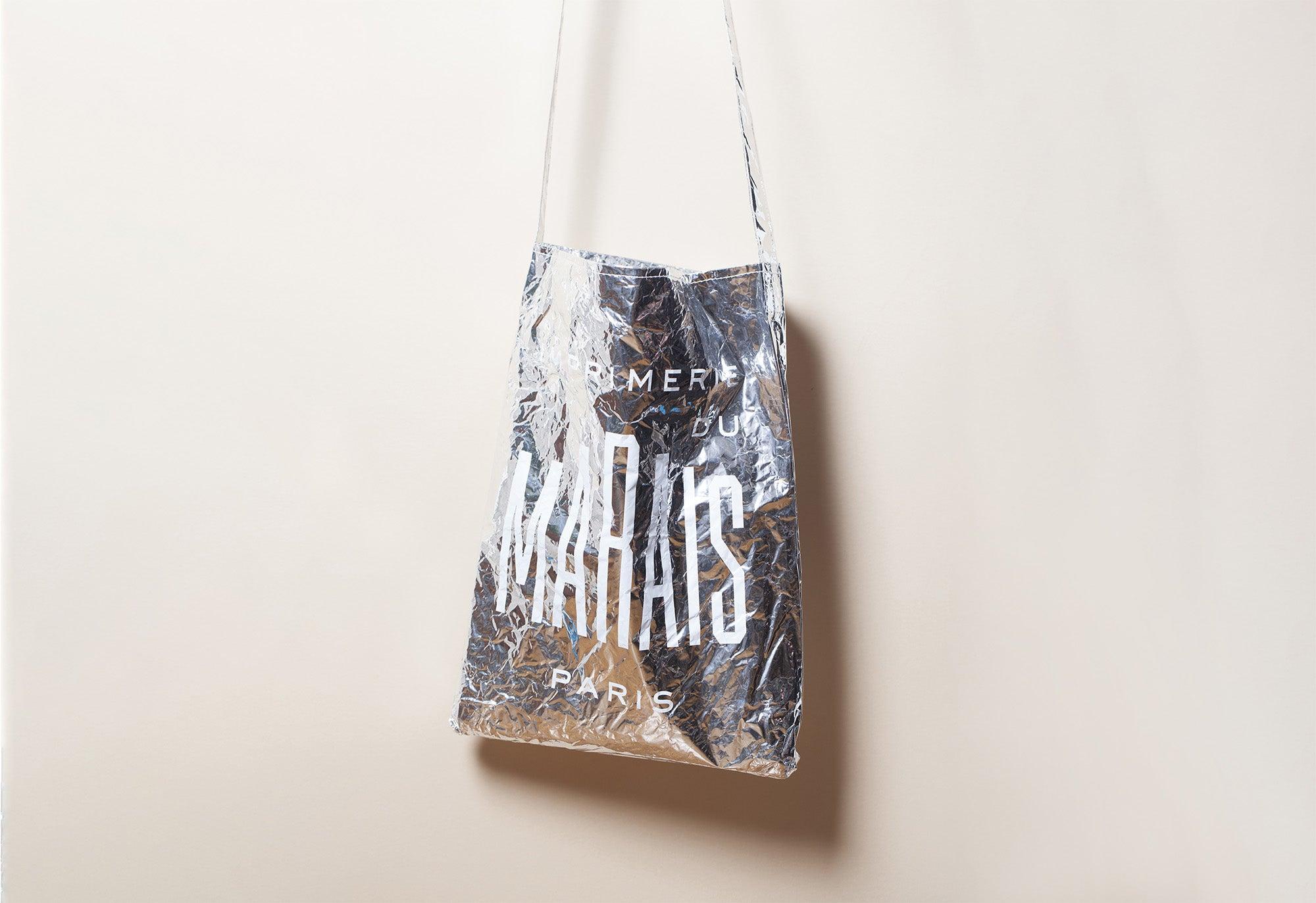
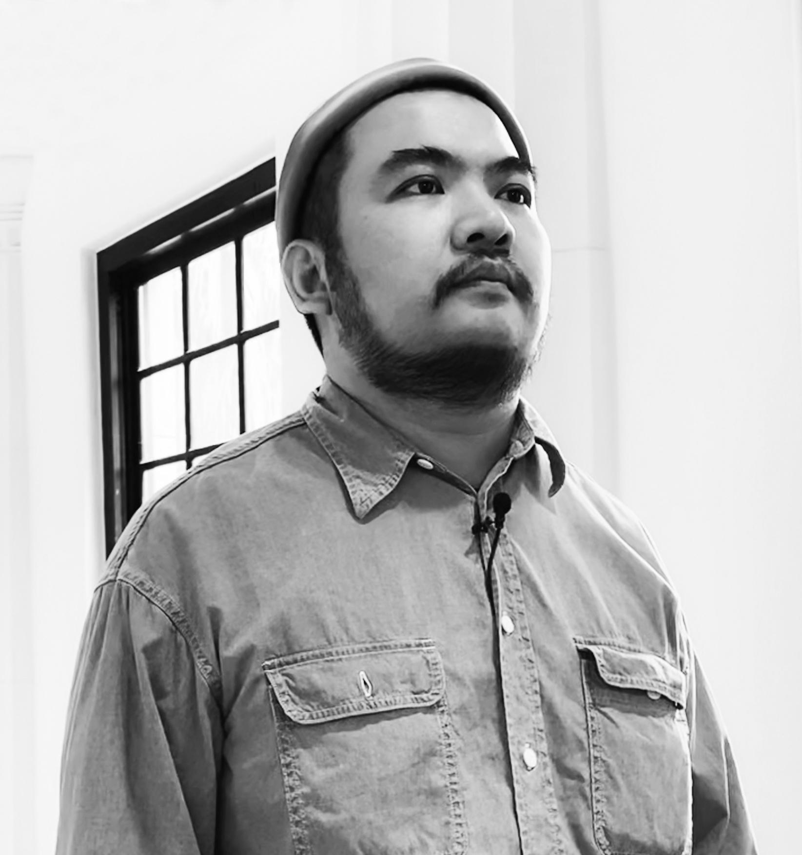
Notebooks III · Page Tsou X Imprimerie du Marais
Interview
Imprimerie du Marais (IDM): What motivated you to take part in this third collection of Notebooks, at the invitation of Imprimerie du Marais and Made Thought?
Page Tsou (PT): I've always tried to highlight the aesthetic of craftsmanship in my artwork, and Imprimerie du Marais's sophisticated printing techniques were a new way for me to enhance this kind of handcrafted spirit that is so precious, especially in this age of popularised digital and AI technologies. I was very curious to see what interesting results could be obtained from such a collaboration. That's what motivated me to take part in this new notebook collection project.
IDM: Had you already designed notebooks before signing the one that is part of this third edition? How did you approach this format here?
PT: My only previous experience of creating notebooks was based entirely on what I would describe as 'passive' use of pre-existing, licensed designs. So, strictly speaking, I've never designed a notebook before. This project was my first attempt at small-scale creation. Working with paper and expressing yourself creatively through printing techniques requires particular attention to detail. I'm delighted to have been able to experiment with this form of expression on this project.
IDM: How did you plan to work with the deployment proposed by the leporello cover in relation to the pages inside?
PT: I liked the fact that I was working on a small, playful format that reminded me of a passport or booklet. However, I instinctively sensed that this would not be a classic notebook for regular use; that aesthetic and creative experimentation would take precedence over practicality. This led me to create a strong contrast between the design of the inside pages and that of the cover, to underline the conceptual approach I wanted to develop through this object.
IDM: What did raise your interest about having to come up with a graphic interpretation of your city, in the broad and complex meaning of the term?
PT: The island of Taiwan is unique for its topography and climate. It therefore has many natural resources that are exploited for their incomparable quality. Bee honey is one of these resources. However, the current development of the country and its megacities is endangering the balance on which this ancestral and essential production is based. Bees are gradually disappearing from the island and honey production is declining.
Starting from the study of my home town and country, I appreciated the fact that I could broaden my thinking to a more general observation about the overdevelopment of megacities and the resulting ecological disruption.
To raise awareness of this issue throughout the notebook I designed, I combined the graphic evocative power of the famous video game Galaxian with that of a phrase wrongly attributed to Albert Einstein.
The sentence describes the consequences of the disappearance of bees in the following terms: "If the bee disappeared off the surface of the globe, then man would have only four years of life left. No more bees, no more pollination, no more plants, no more animals, no more man." The reasoning may be scientifically questionable, but it is no less meaningful.
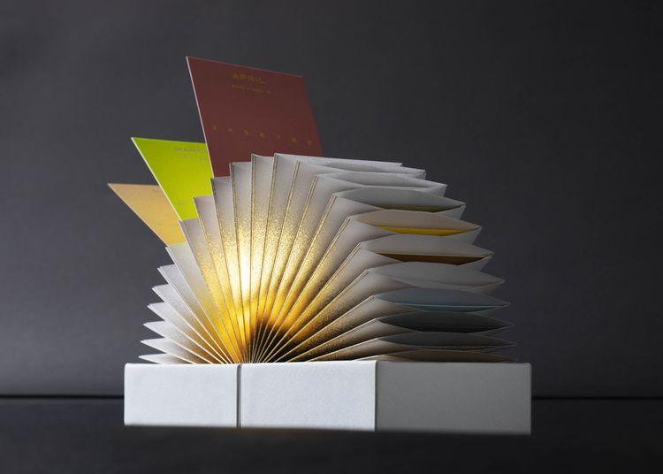
And so, as the pages of the notebook I designed turn, the precious bees that symbolise Nature gradually disappear under the fire of the Galaxip hunter who represents Humanity, foreshadowing that the worst is yet to come.
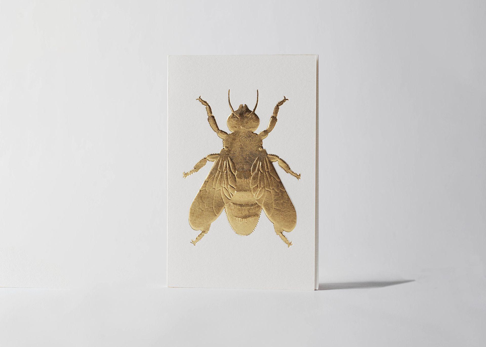
IDM: Was it your awareness of the increasing scarcity of the bee that led you to turn it into an extremely precious printed specimen, the result of multi-level embossing and microstructure foiling? What were your desires/ambitions, both conceptual and technical?
PT: I imagined this work as a fable designed to alert us to the urgent need to preserve the living world. And I, indeed, wanted to highlight its preciousness through the printing techniques used.
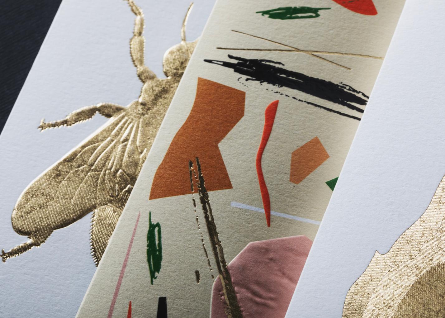
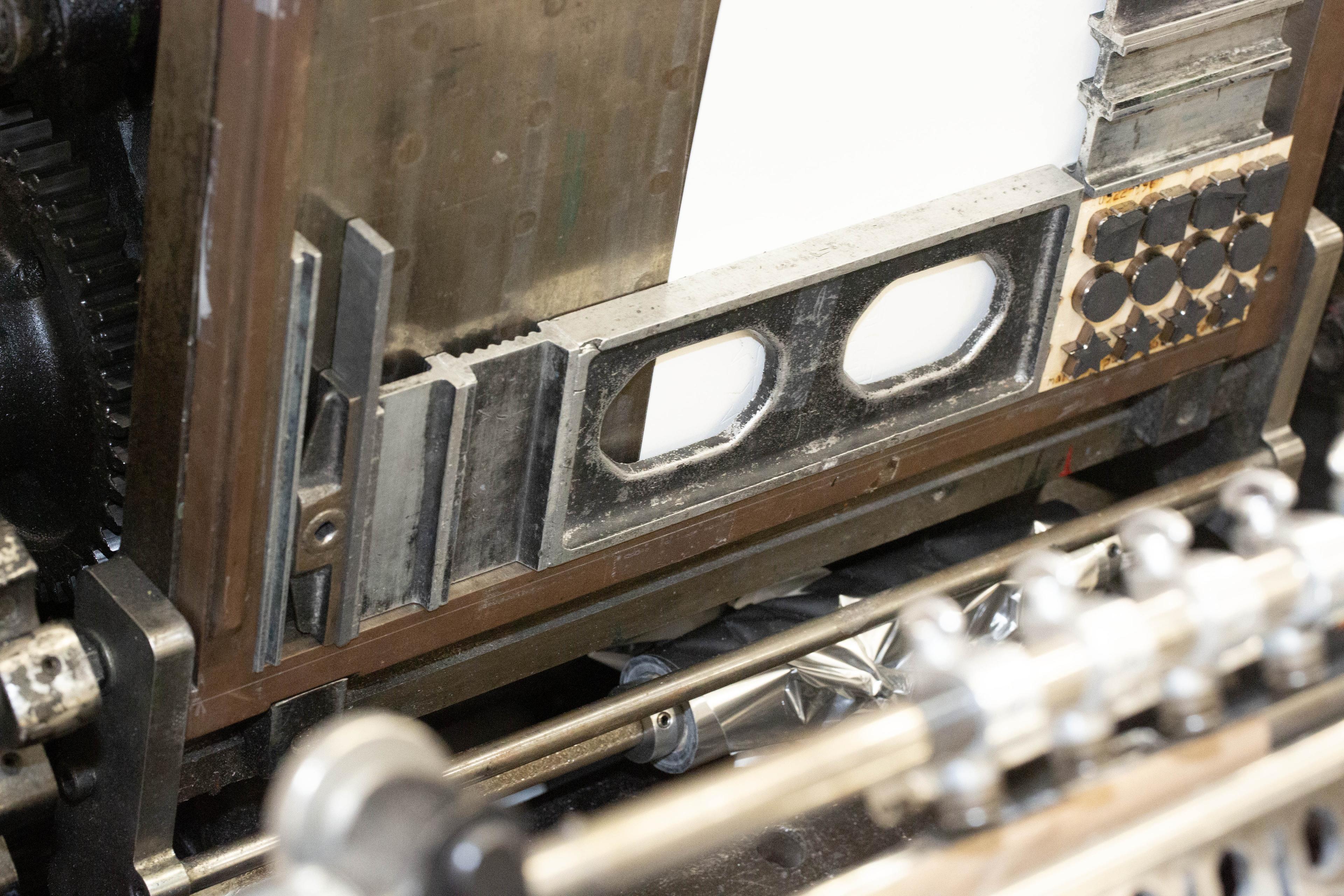
I was hoping to use a combination of a gold-sunny-honey tones microstructure foiling with a multi-level embossing to create two gorgeous bees in semi-relief on the front and back covers. The skilled craftsmen at Imprimerie du Marais worked very closely with me to achieve this remarkable feat.
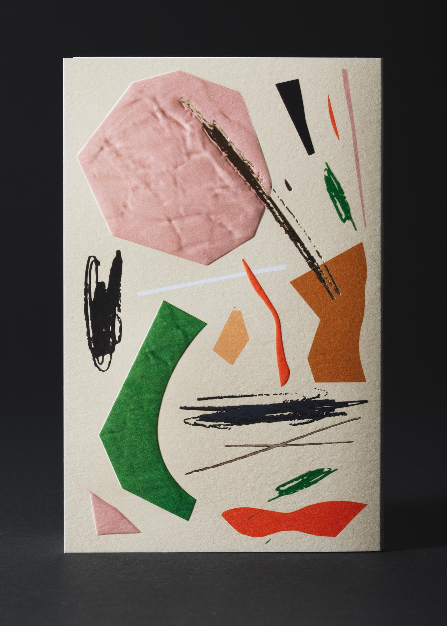
The final result is everything I hoped for: in a kind of epiphany, the bees are given a sacred essence, like icons or religious allegories. As for the inside pages, they feature four-colour litho printed reproductions of my handmade illustrations. Together they form a flipbook, reminiscent of the spirit of the video game in a low-tech version.
I believe that this gentle contrast between the cover and the inside pages emphasises the strength of the tale that I wanted to tell to make it count.
IDM: Did you also have concerns?
PT: I was worried I wouldn't be able to make the most of the printing techniques I was given to explore, which are among the most special and complex. I was worried that I wouldn't be able to make the most of the unique aesthetic powers of this craft through my creative intent. So, I hope that in producing this notebook I have honoured the beauty of printing as much as I have honoured the beauty of bees.
IDM: Now that you finally have a copy in your hands and 8 years of hindsight, what do you think of the notebook you produced? If you were to accept the same invitation today, would your proposal be different?
PT: I don't think I would have envisioned it any differently. Sadly, bees continue to disappear and the living world is still in great danger... However, the Imprimerie du Marais has undoubtedly made progress in the techniques used, and I would very much like to have another opportunity to challenge my work with their cutting-edge skills, perhaps in a more daring way. I'd like to be able to push their boundaries even further, with the aim of presenting ever more innovative visual art.
IDM: What do you think of the projects carried out by the other studios? Have any of them particularly impressed you or taken you on a journey?
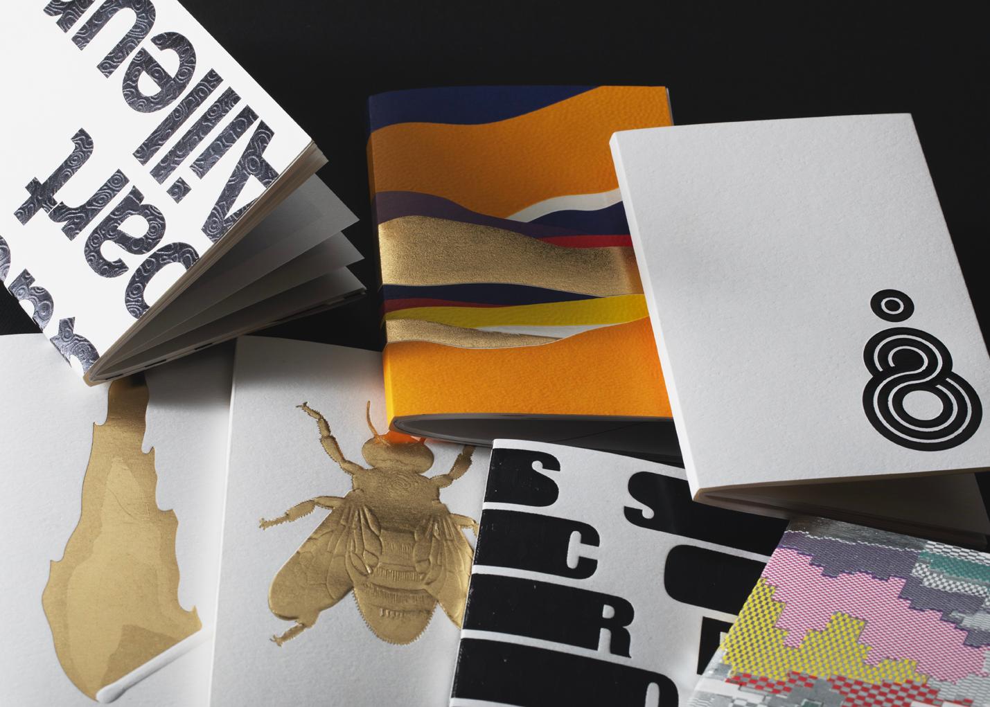
PT: The contributors come from all over the world and their different backgrounds and cultural influences are reflected in their own visual language. Through the diversity of printing techniques applied to the sublime papers in the Conqueror range, their inspiring concepts are transformed into a magnificent micro-exhibition.
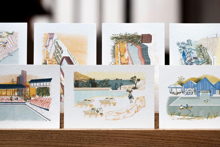
Personally, I love Lotta Nieminen's work. Her abstract style, her relaxed graffiti lines combined with random blocks of colour worked in a variety of techniques, give me a total feel for the free and energetic atmosphere of New York.
IDM: What does the idea of a journey through time and space evoke in you when it comes to presenting this new collection? Does it invite you to take a fresh look at the work you've done? Between retrospective and prospective perspective, what new possibilities would you like to explore?
PT: To be honest, this whole experience has been a bit like travelling back in time to my days as an art student in London. Whatever relatively free creative space I have at my disposal, after all these years I'm still the same (overly?) serious student. From this point of view, the collaborative aspect of the project and the powerful proposals made by the other guest designers stimulated my imagination in many positive ways.
I thoroughly enjoyed working on this project, which was as exciting as it was entertaining. It has made me very happy and encouraged me to re-evaluate both my work and my approach. I'm looking forward to the next opportunity to explore a more relaxed and experimental form of expression, using eco-conceived materials.
"This project was my first attempt at small-scale creation."

Behind the scene
The Workshops
"I imagined this work as a fable designed to alert us to the urgent need to preserve the living world, whose preciousness I wanted to highlight through the printing techniques used."
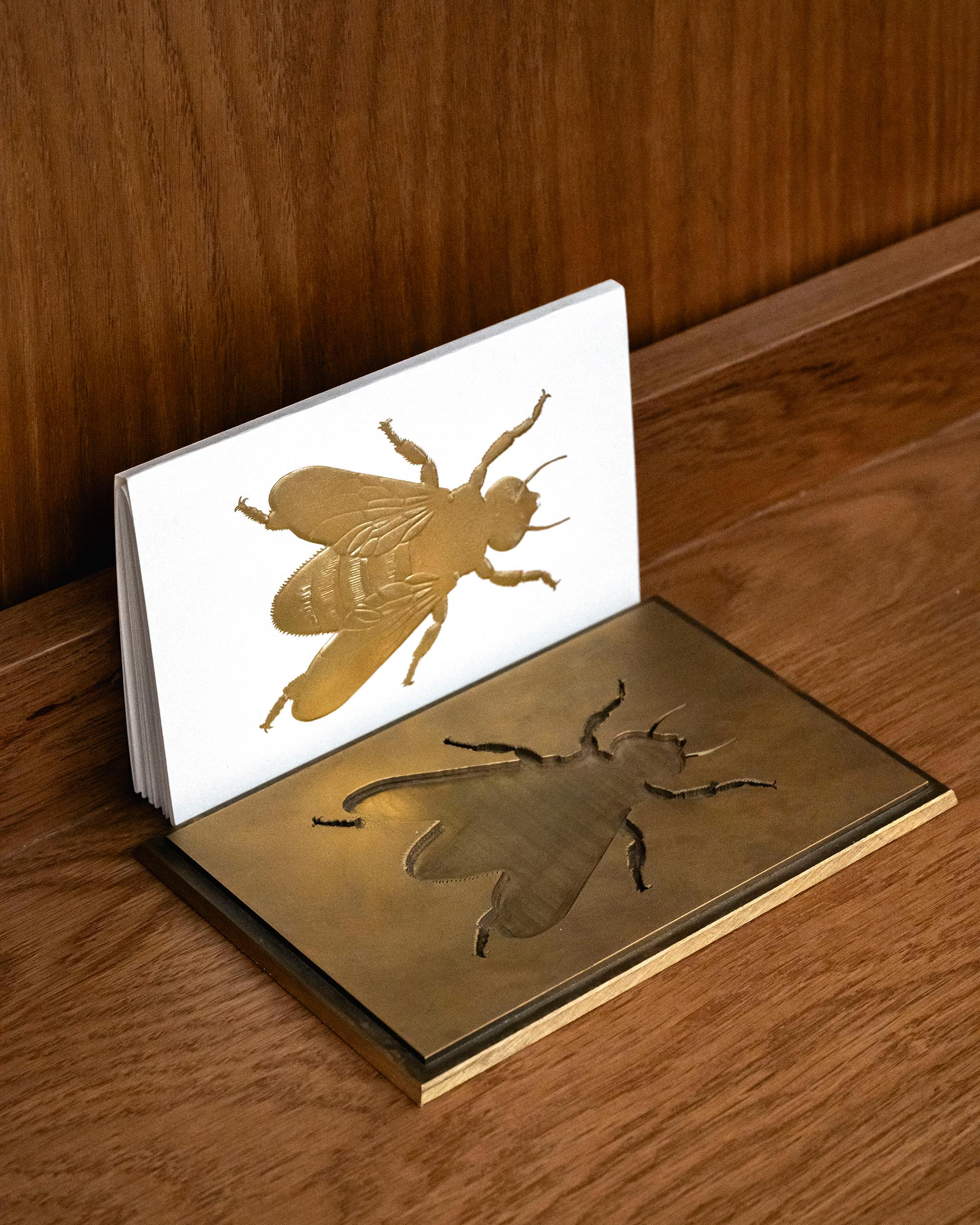
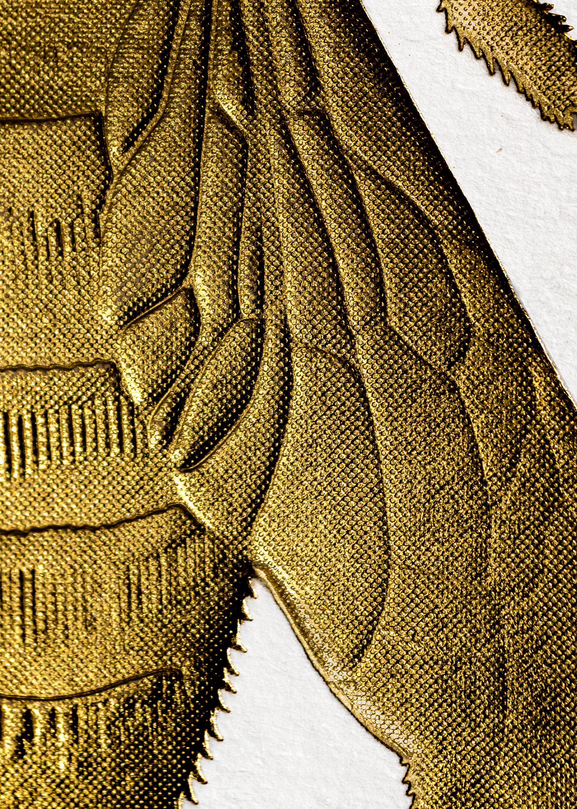
"Through the combination of multilevel embossing and microstructure foiling, the bees are given a sacred essence, like icons or religious allegories."
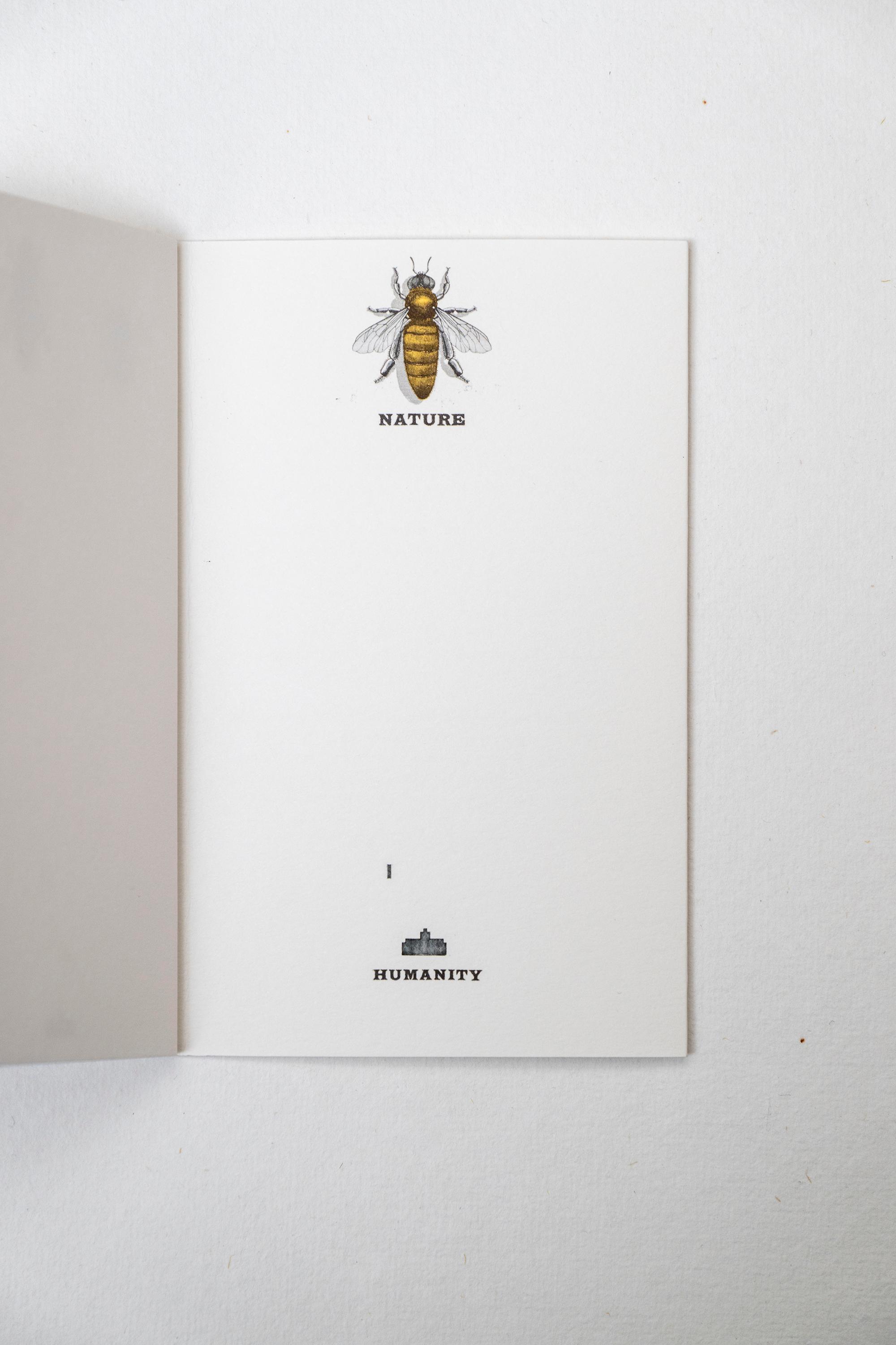
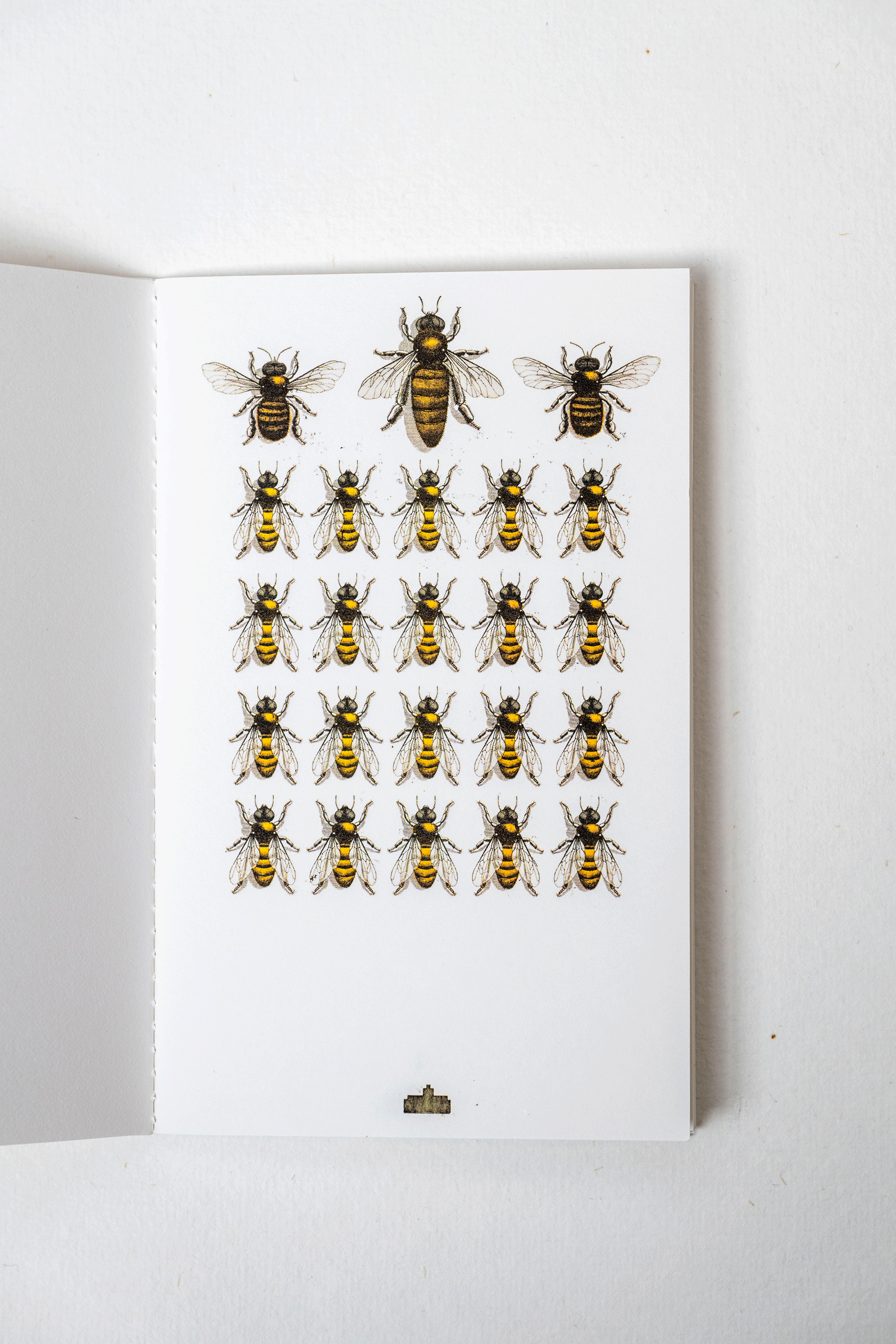
"The inside pages feature four-colour litho printed reproductions of my handmade illustrations. Together they form a flipbook, reminiscent of the spirit of the video game in a low-tech version."
"I love Lotta Nieminen's work. Her abstract style, her relaxed graffiti lines combined with random blocks of colour worked in a variety of techniques, give me a total feel for the free and energetic atmosphere of New York."