Notebooks III · Studio Ongarato x Imprimerie du Marais
Interview
What motivated you to take part in this third edition of Notebooks, at the invitation of Imprimerie du Marais and Made Thought?
It was a pleasure to be invited to participate in this global project. We have great respect for the work of Made Thought and it was a wonderful opportunity to explore the potential of print with Imprimerie du Marais. Both of them share common values with our own, including an appreciation of the craft and the tactile experience.
What did you like about having to come up with a graphic interpretation of your country, in the broad and complex meaning of the term?
Our nation's identity is complex and constantly evolving, which makes the task of producing a visual interpretation of it an ambitious one.
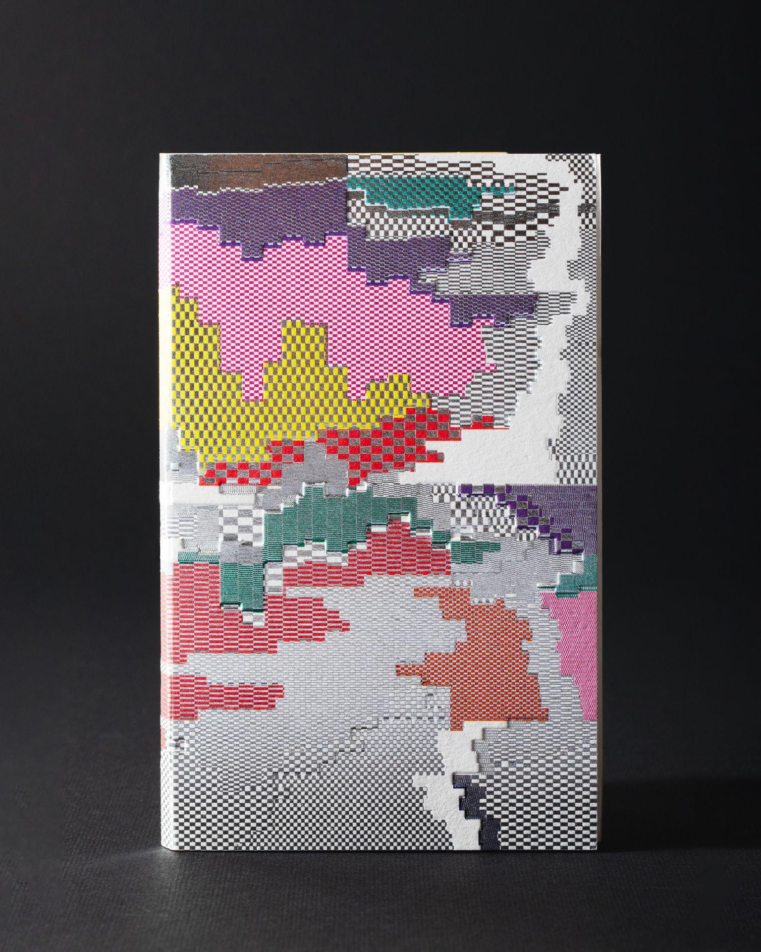
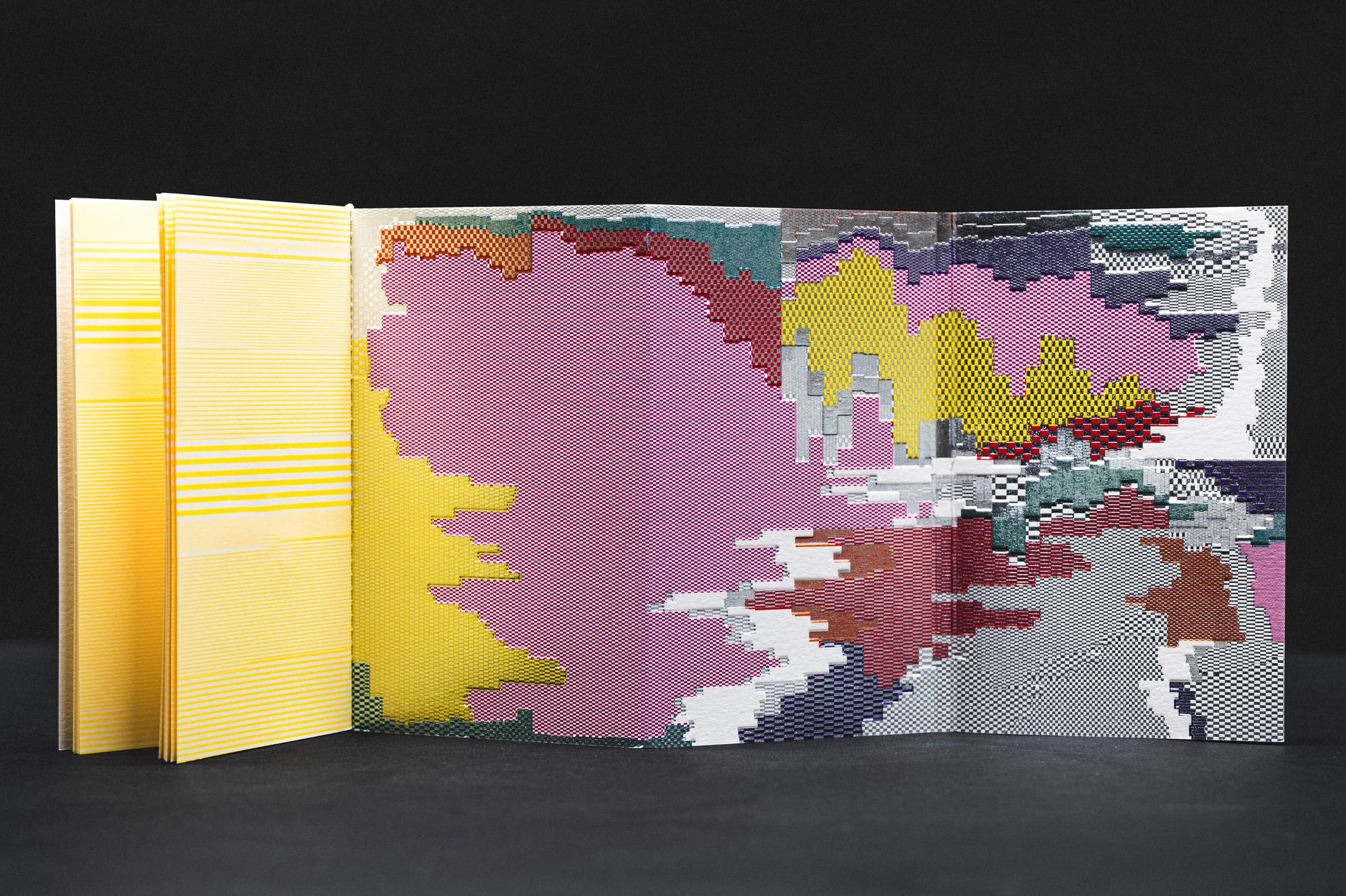
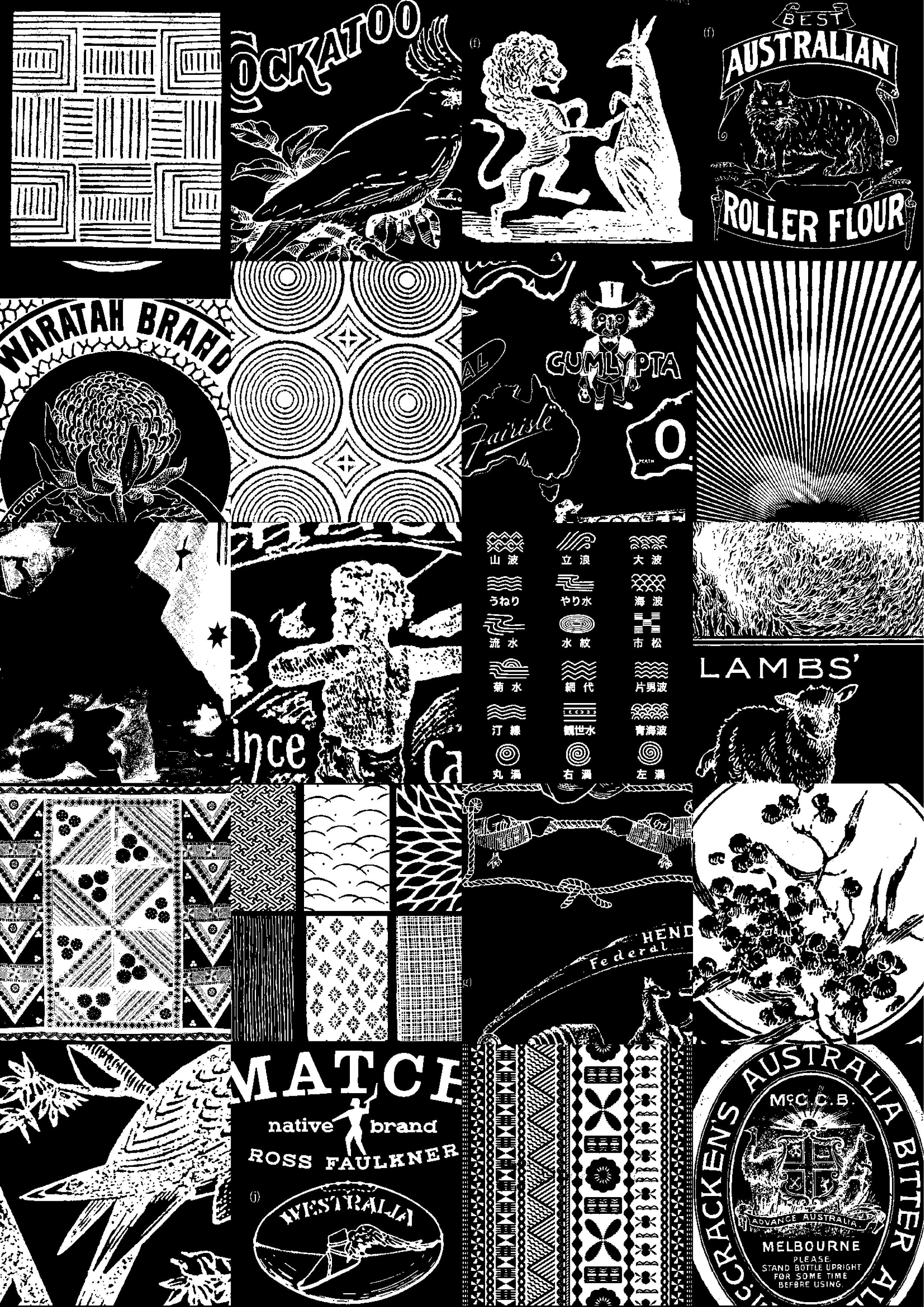
We had included a text with our contribution: “Although Australia is home to one of the oldest indigenous cultures on earth, even its ancestors can be traced to South-East Asia. The island-continent is home to many cultures, ethnicities and nationalities, blended together over time. Thus, the ‘melting-pot’ essence of Australian culture reflects both the founding history and future identity of the nation.”
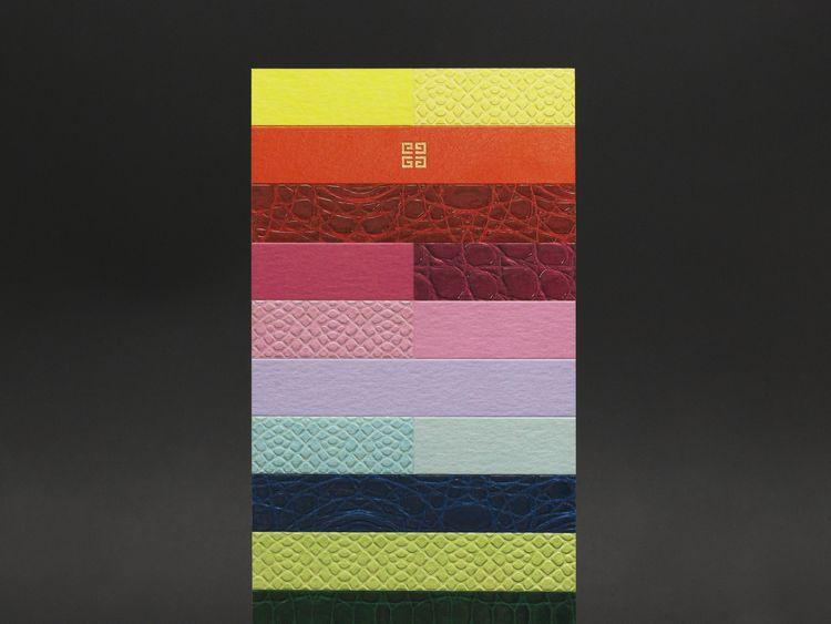
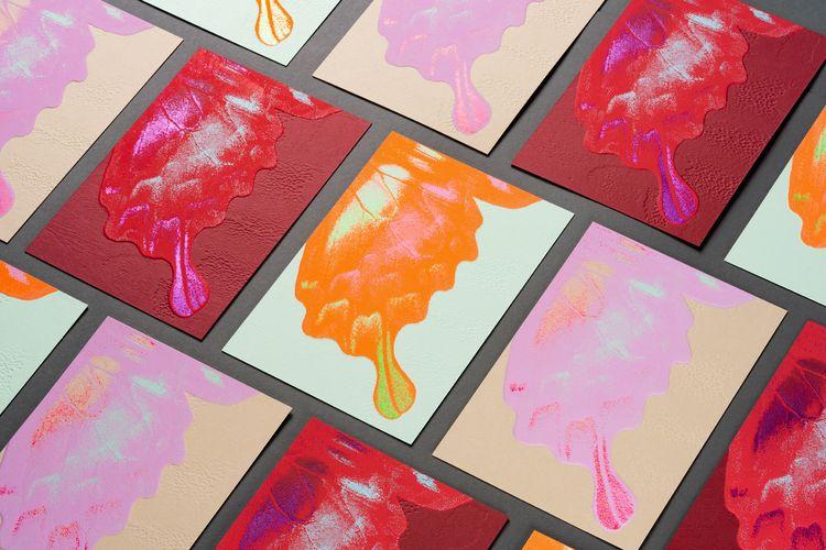
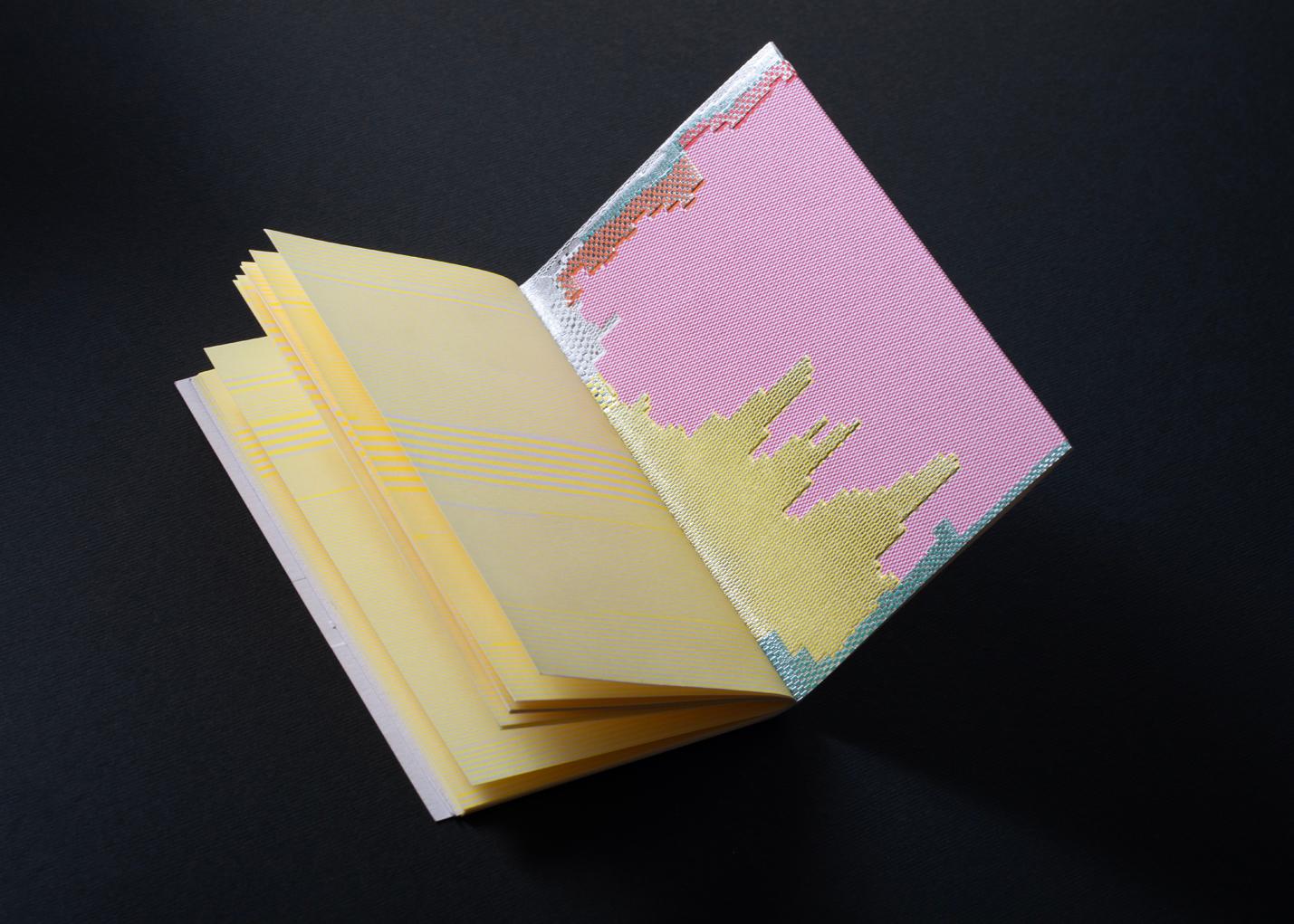
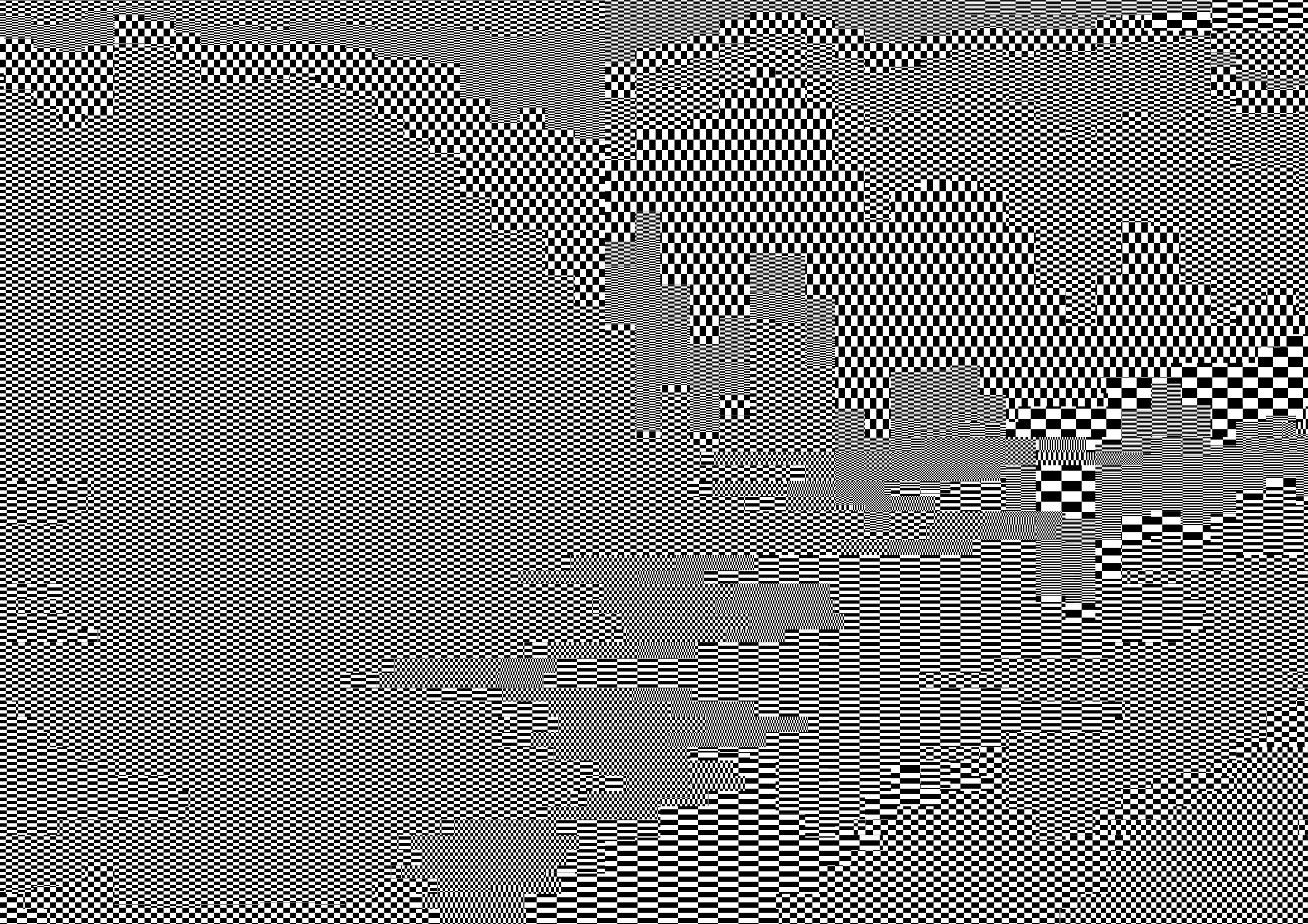
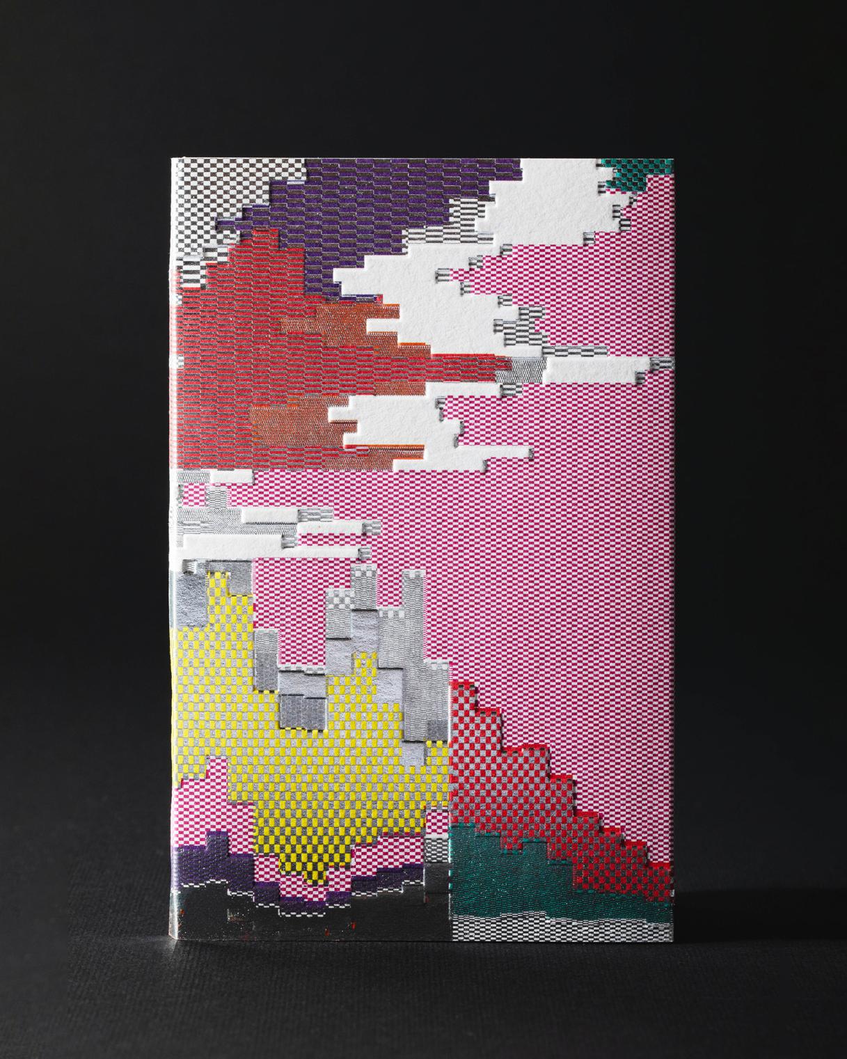
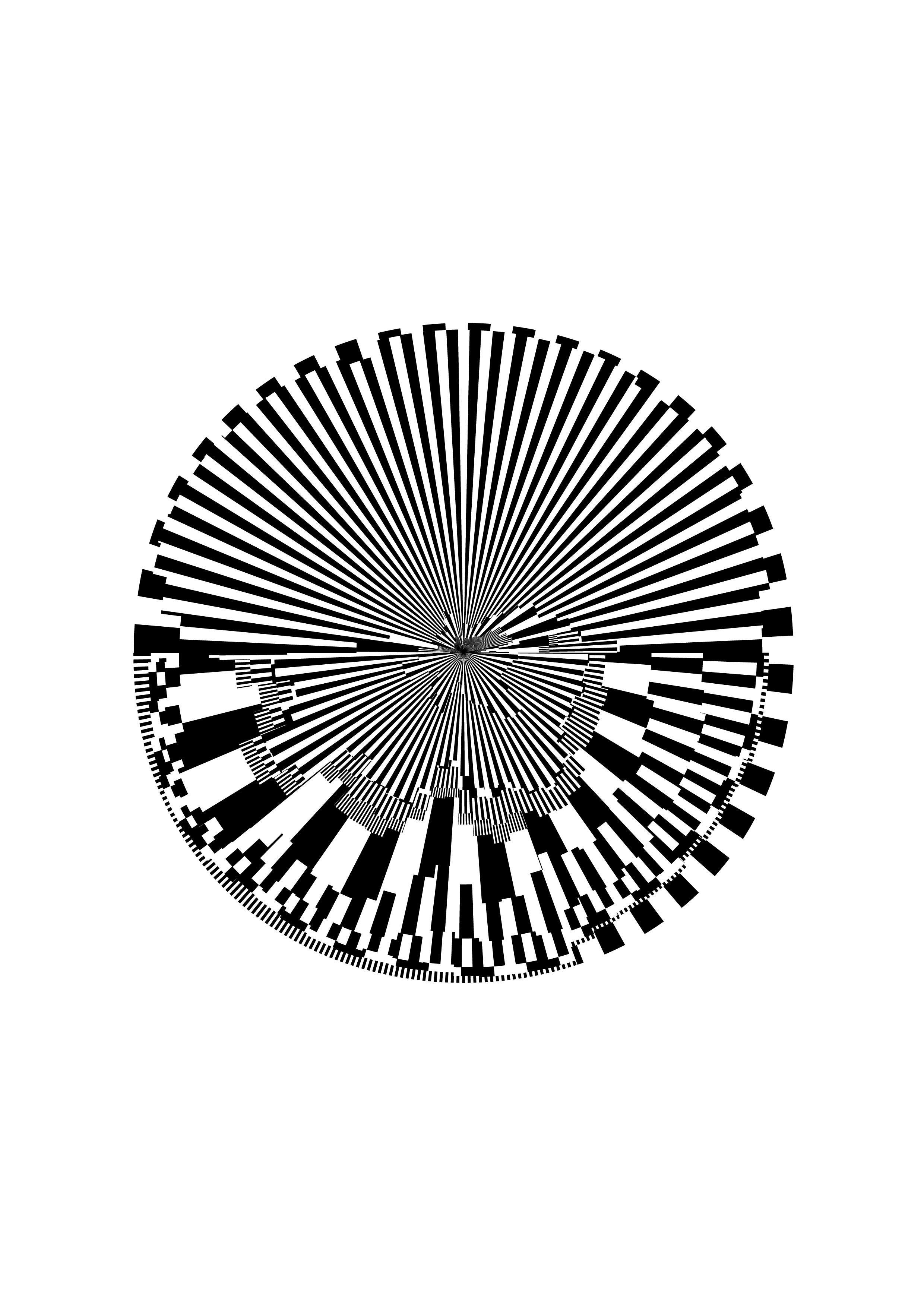
Rather than representing Australia through the stereotypes that usually characterise it, we have chosen to consider its demographic data as objective forms of narrative. In this way, we mapped the changing face of the country through the history of its immigration, going back as far as recorded. Using the chronological graph as a framework, we wove together different types of information on opposite axes. The result is a tapestry that transcribes this melting pot. The mosaic that is the Australian identity is powerfully captured here in a complex combination of various printing techniques that interact and overlap.
Had you already designed notebooks before signing the one that is part of this third edition? How did you approach this format here?
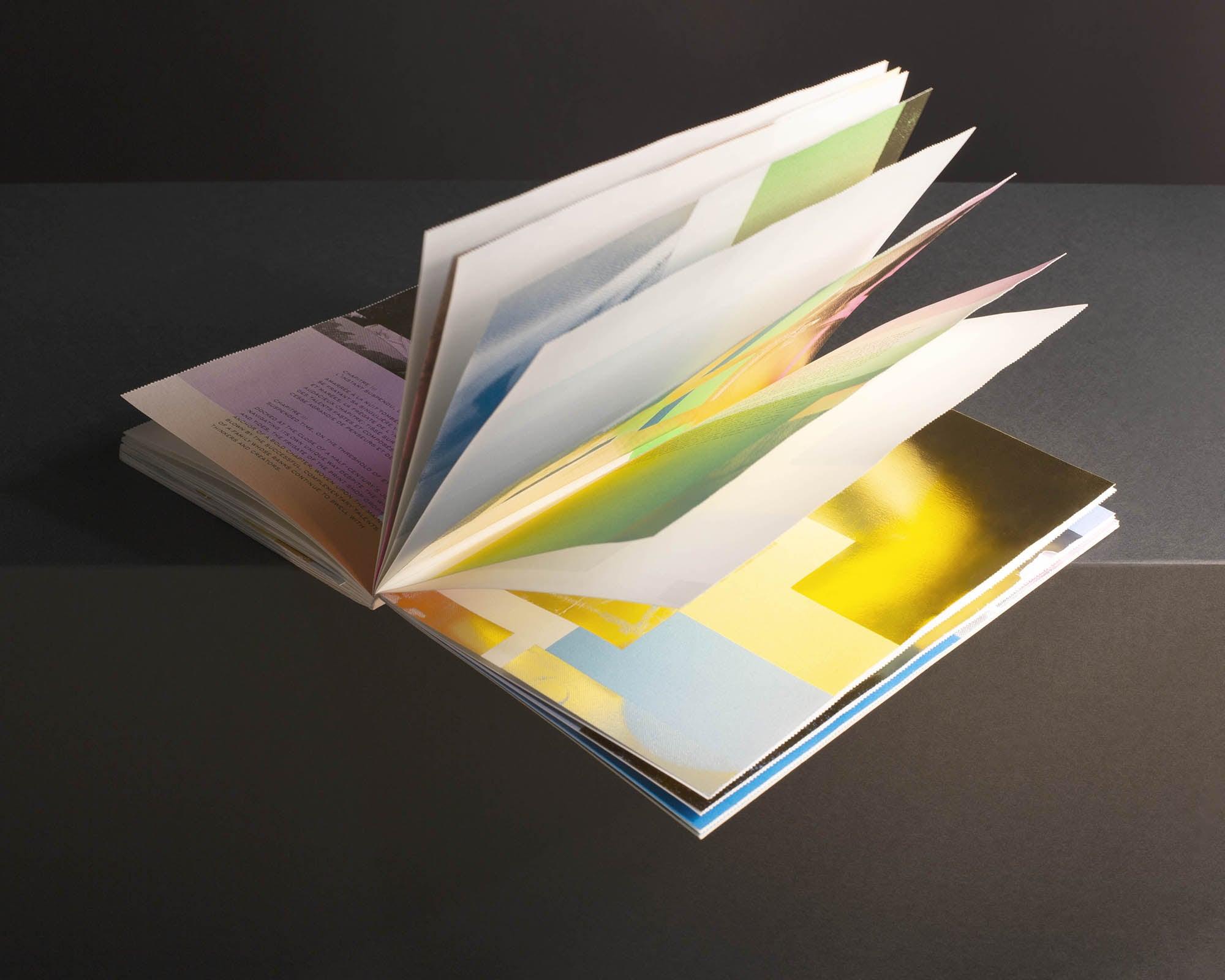
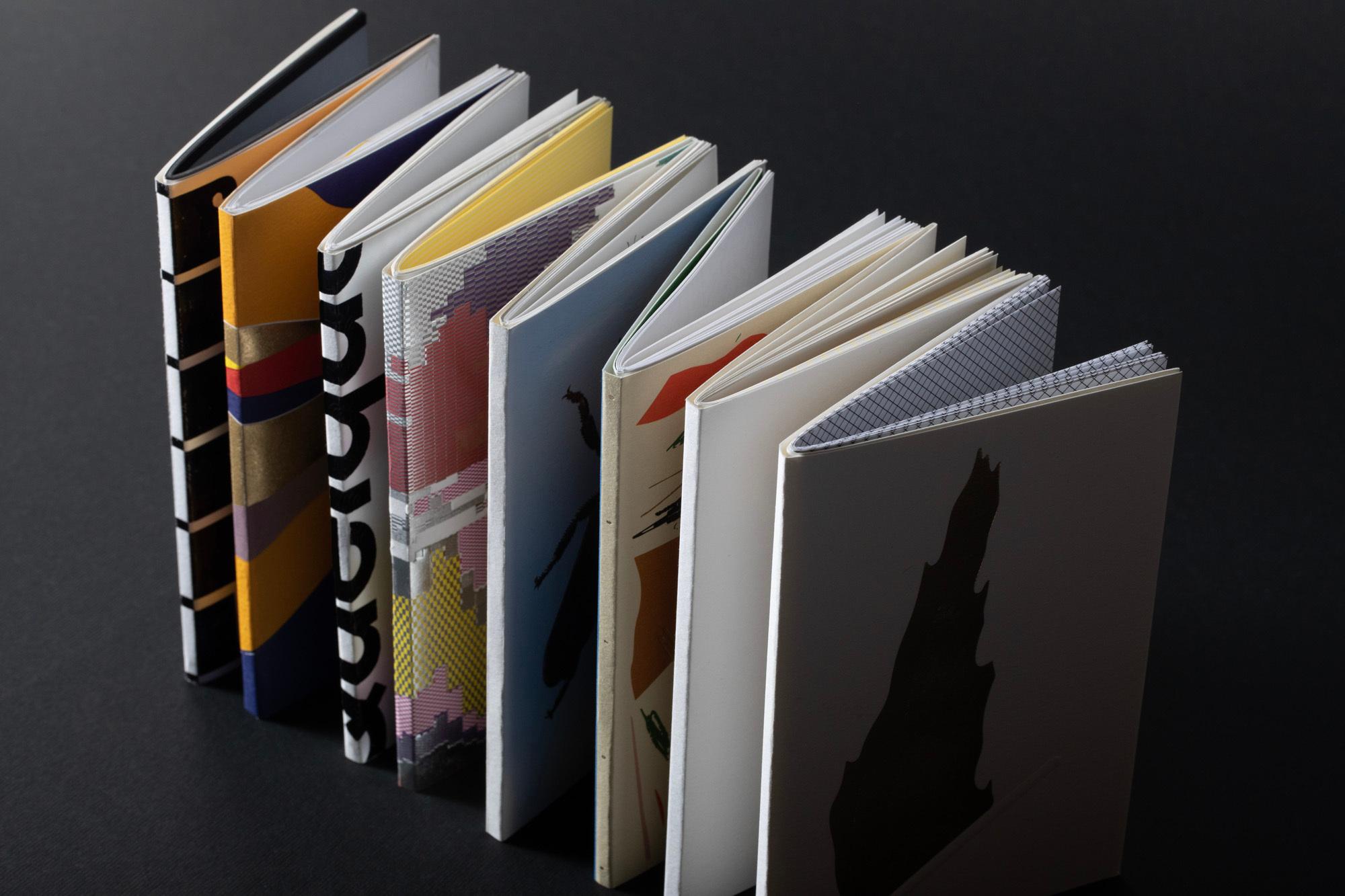
Previous notebook projects we've worked on have been more restrained in terms of expression and print, simply representing the brand and meeting the client's specifications. The carte blanche we were given as part of the creation of this collection of notebooks was much more open. It allowed us to explore the expressive, experimental and playful vein of our designs.
How did you plan to work with the deployment proposed by the leporello cover in relation to the pages inside?
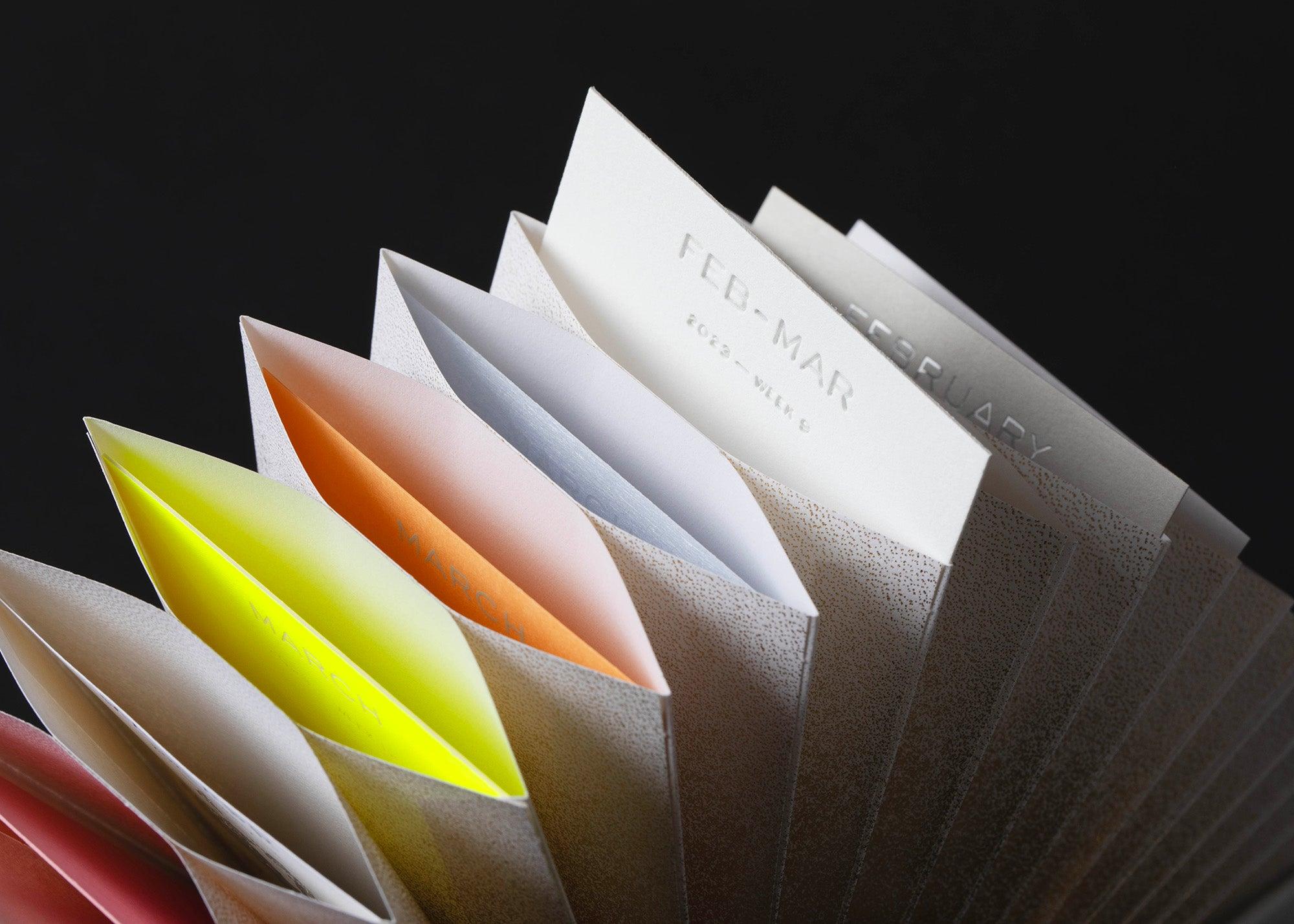
The format provided ways to expand the concept, where the timeline was stretched across the cover and text, in a similar way to iconic uses of the format, like Ed Ruscha’s Every Building on Sunset Strip book with the expansive streetscape.
What were your desires/ambitions, both conceptual and technical? Did they echo work already done or in progress, or did they generate a whole new exploration?
We were keen to integrate a set of strict data into the design with fidelity and precision through the printing techniques offered to us. We also felt it was important to combine different printing techniques in order to poetically echo the diversity of the Australian identity. The combination of microstructure foiling and embossing seemed a natural fit.
Did you also have concerns?
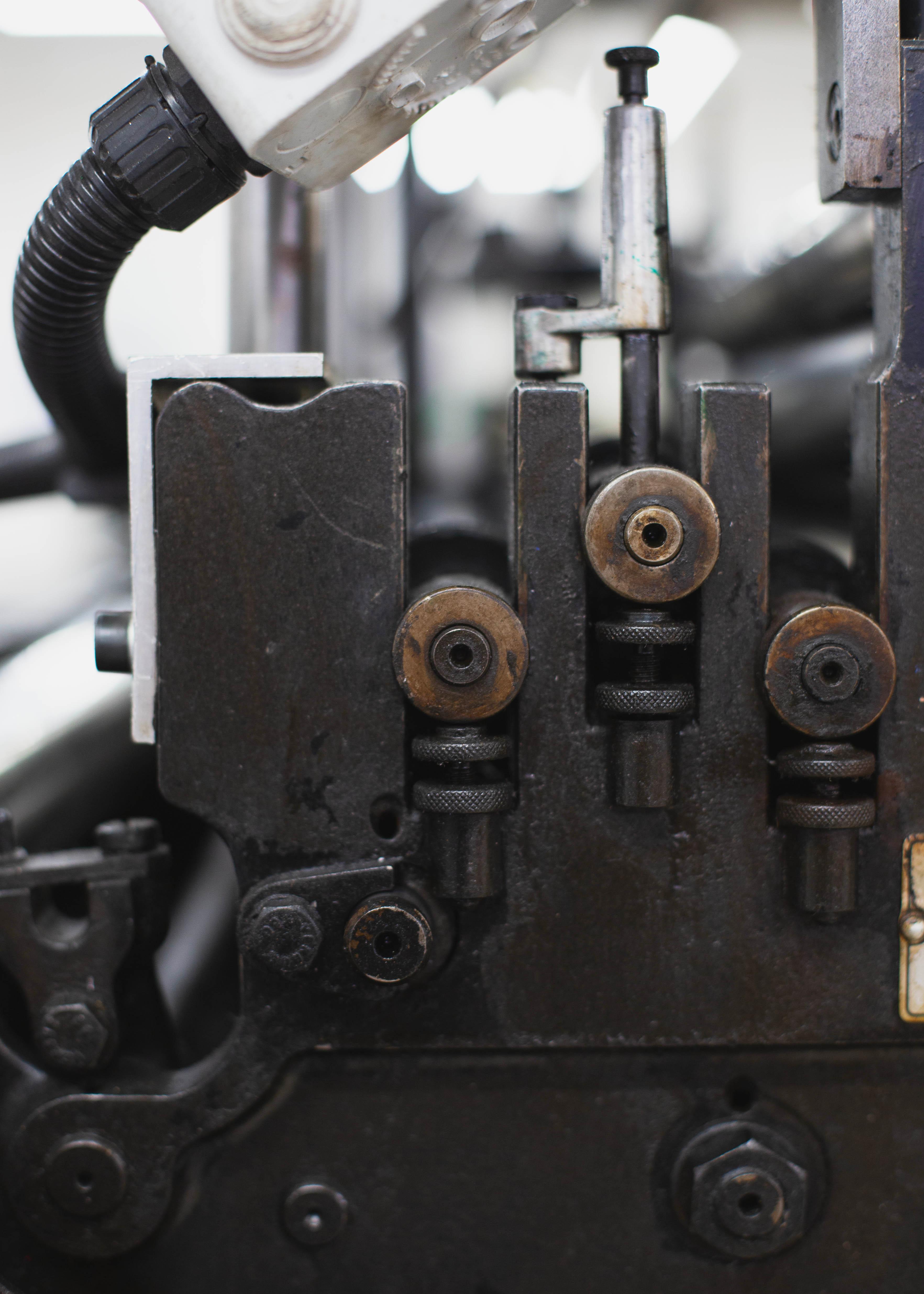
The complexity of the design and techniques required the meticulous registration of many elements, which is usually a challenge when it comes to printing. We therefore had some concerns about the rendering, which were quickly dispelled as we worked with the experienced teams at Imprimerie du Marais.
Now that you finally have a copy in your hands and 8 years of hindsight, what do you think of the notebook you produced? If you were to accept the same invitation today, would your proposal be different?
The design of the cover is in itself a time capsule. It therefore reflects a specific period. Developing the same concept today would undoubtedly lead us to a slightly different visual interpretation–in line with our current understanding of contemporary Australia–while keeping its interest intact.
What do you think of the projects carried out by the other studios? Have any of them particularly impressed you or taken you on a journey?
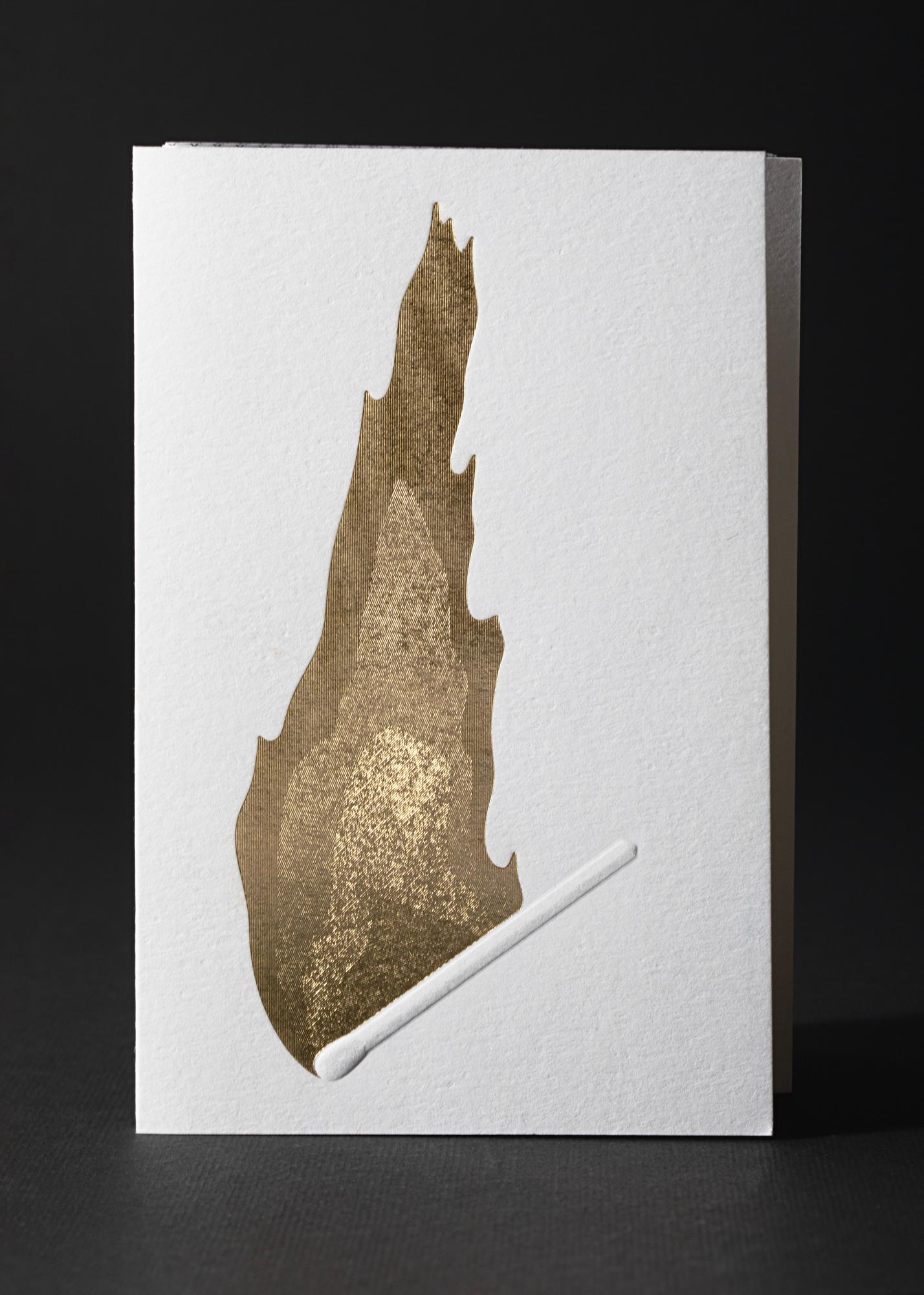
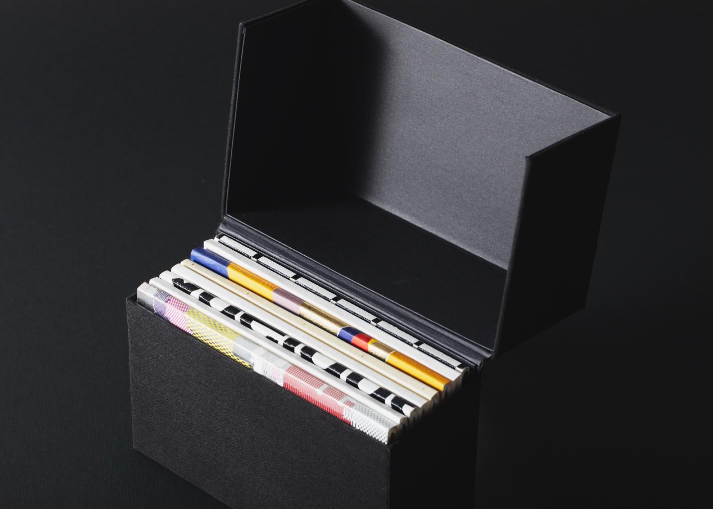
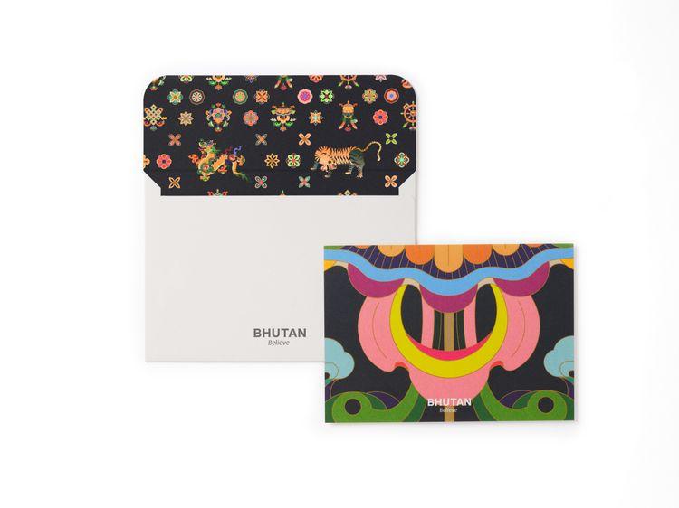
Kazunari Hattori's work around fire and water is both elegant and tactile. It poetically crystallises the contrasting yet nuanced character of Japan. Page Tsou's environmental message, expressed with grace and sensitivity, opens up this collection of notebooks to concerns that are now omnipresent, affecting all citizens of the world. Each of the 8 proposals in this collection is a unique contribution to the creation of a distinctive whole.
What does the idea of a journey through time and space evoke in you when it comes to presenting this new collection? Does it invite you to take a fresh look at the work you've done? Between retrospective and prospective perspective, what new possibilities would you like to explore?
We like to think that everything we create is designed to be long-lasting, in both form and content. But that doesn't stop us from being driven by the desire to innovate. With this in mind, we are always happy to pursue collaborations around the world, discovering new media and more.
Behind the scene
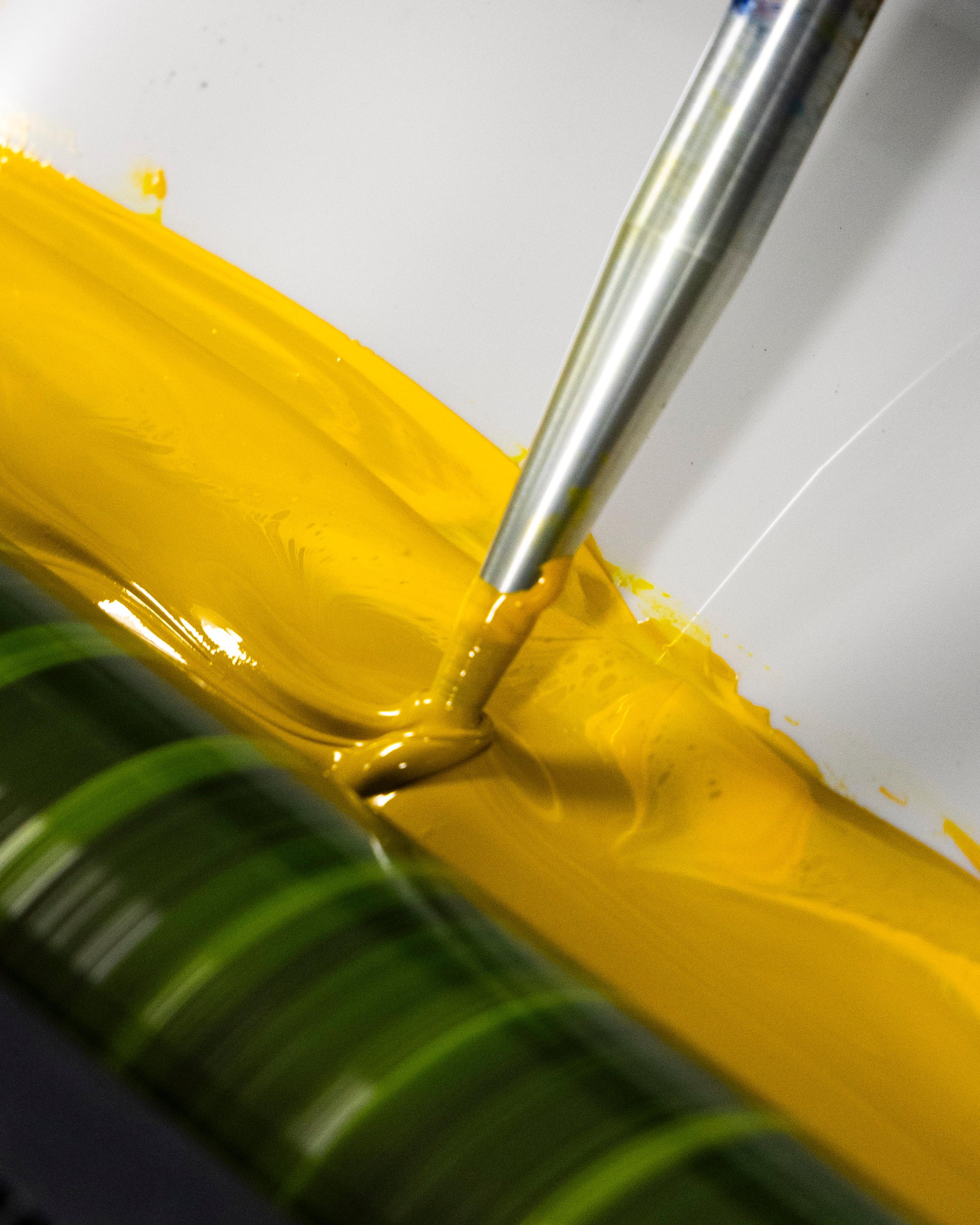
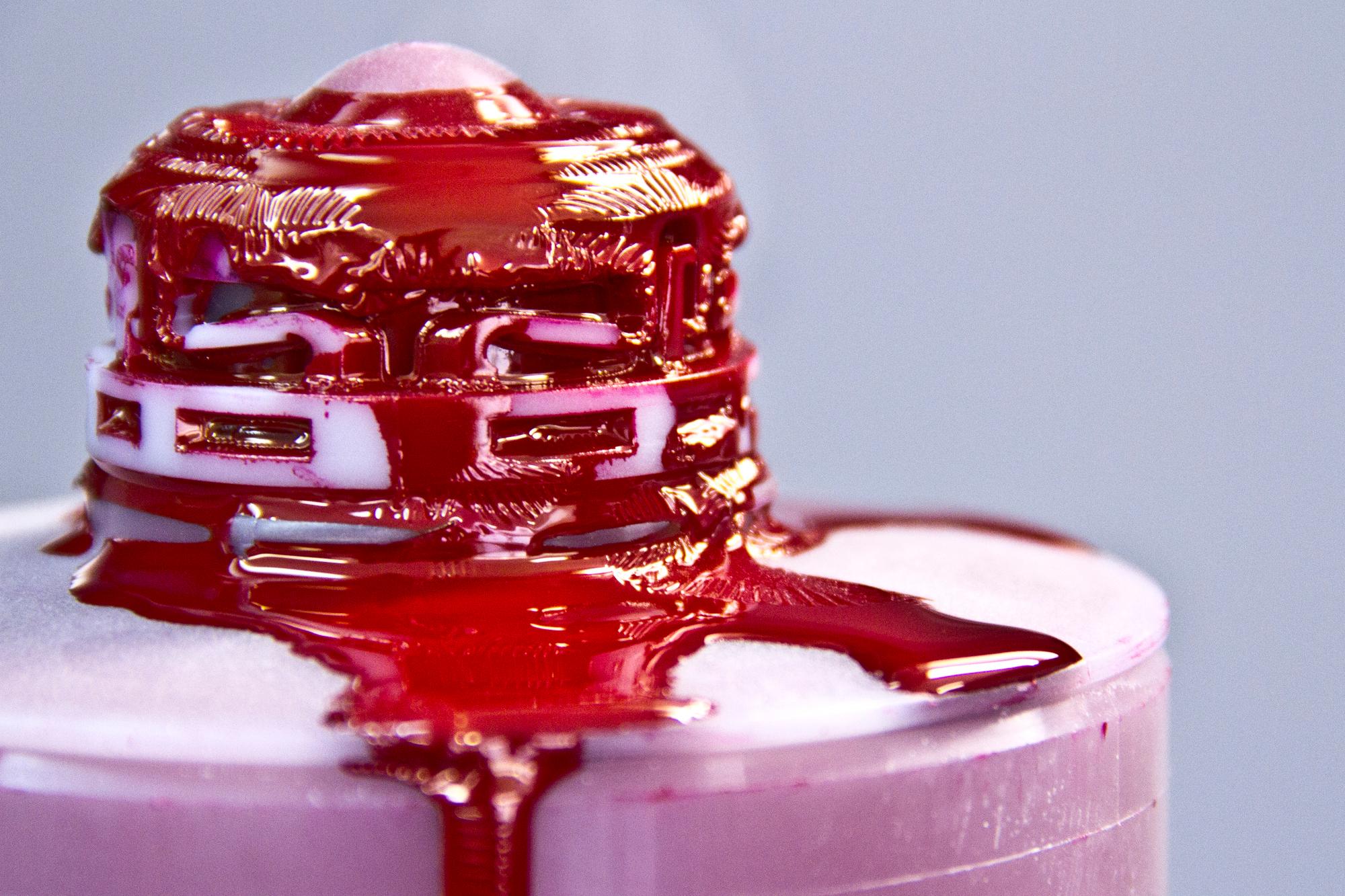
The Workshops
"Rather than representing Australia through the stereotypes that usually characterise it, we have chosen to consider its demographic data as objective forms of narrative."
"The mosaic that is the Australian identity is powerfully captured here in a complex combination of various printing techniques that interact and overlap."
"The carte blanche we were given as part of the creation of this collection of notebooks was very much open. It allowed us to explore the expressive, experimental and playful vein of our designs."
"Kazunari Hattori's work around fire and water is both elegant and tactile. It poetically crystallises the contrasting yet nuanced character of Japan."